Screenshot / Rumbler
-
 16-March 14
-
 Sunset Vista
-

 8 of 17
- Views 2,668
- Fans 2
- Comments 7
-
 Description
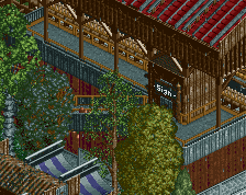
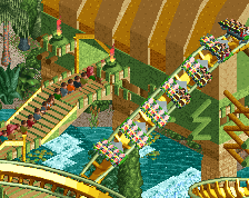
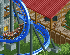
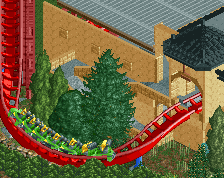
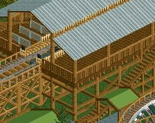
Sunset Vista's modern wood coaster is Rumbler. Rumbler is a GCI coaster featuring swooping turns, a curving first drop and a station fly through.
The first drop is heavily inspired by Thunderhawk at Hudson Crossings by Maverix and the coaster as a whole is inspired by Dollywood's Thunderhead (though the layout is quite different). -
 Full-Size
-
2 fans
 Fans of this screenshot
-
 Tags
Tags
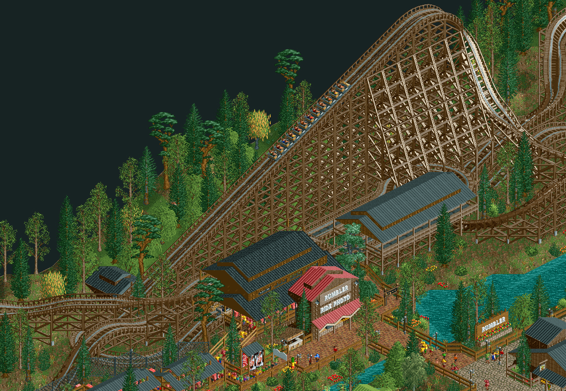

I'd simply raise the turn into the lift 1 clearance so it doesn't look flat on the ground
I don't like the square in front of the station. Lower those fences and give the square a bit more room to breathe. Right now it looks like a prison yard. The rest looks pretty good!
I agree with faas.
What do you think of this? I widened the plaza a little bit.
I like it better, but I would make sure the bricks are all facing the same way.
That is much better. Really like that.