Screenshot / Hello again
-
 14-April 21
-
 Belle Isle
-
 1 of 11
- Views 4,859
- Fans 3
- Comments 20
-
 Description
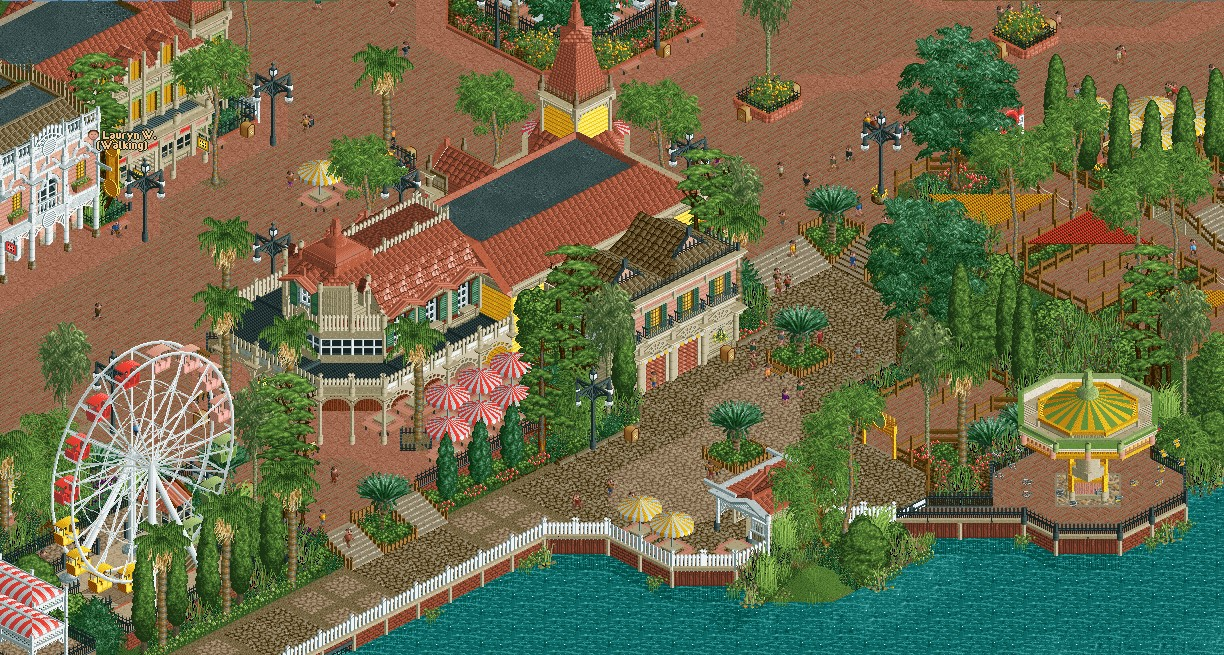
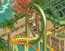
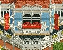
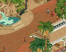
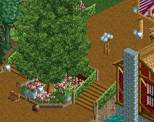
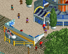
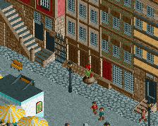
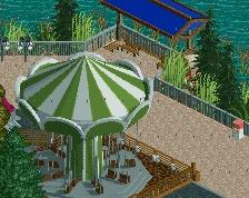
Hello everyone. It has been a while since I have been active on this site. I haven't posted a screenshot since 2015, though maybe some here may remember me? Anyway, I have been building again the last few weeks, and here is a screen of what I've been working on. Please let me know what you think. As I have gotten back into the swing of building I find myself constantly changing direction on what exactly I want to get out of this park and what I'm doing so suggestions for improvements are very welcome.
-
 Full-Size
-
3 fans
 Fans of this screenshot
-
 Tags
Tags
RaunchyRussell Offline
This is fantastic dude. Welcome back. There's nothing to really gripe about. Maybe too much path near the top, but who cares. Very nice overall vibe you captured here.
Pleasant. Can imagine being here. Might be worth adding some longer/larger planters in the wide street/path.
thats gorgeous. great color choices.
What a fucking comeback
The scale is phenomenal. Very open with some great buildings as focal points. I hope you post more!
This is great! I might have a few less large trees in front of that patio so they have an open view of the waterfront but otherwise I have no complaints.
This is excellent. Great vibes.
I do think the warmth is a plus, but I can't help but think that it's a little too red. Changing the paths and some of the brick around the planters could be a welcome change. Basically seems to lack just a tiny bit of contrast for me.
That little pink/white facade in the top left is amazing though.
Who asked ya, Rusticles
love it. I think some bright blue accents in places (flowers, awnings, umbrellas) could be a nice contrast to all the reds.
very pleasant
Personally also wouldn't change a thing. It looks gorgeous. Good scale, good composition, good colours, good architecture. I'm not sure I've ever liked that red path this much to be honest. Very nice to see this.
Appreciate the encouraging comments everyone, you guys are great. I am happy to see people are digging this, there will be more to come soon!
adorable
Great atmosphere and warm tones. I can't even think on this level, my brain doesn't build this way. Welcome back.
Superb