Screenshot / Alpengiest: Icestorm
-
 05-April 21
- Views 2,677
- Fans 0
- Comments 11
-
 Description
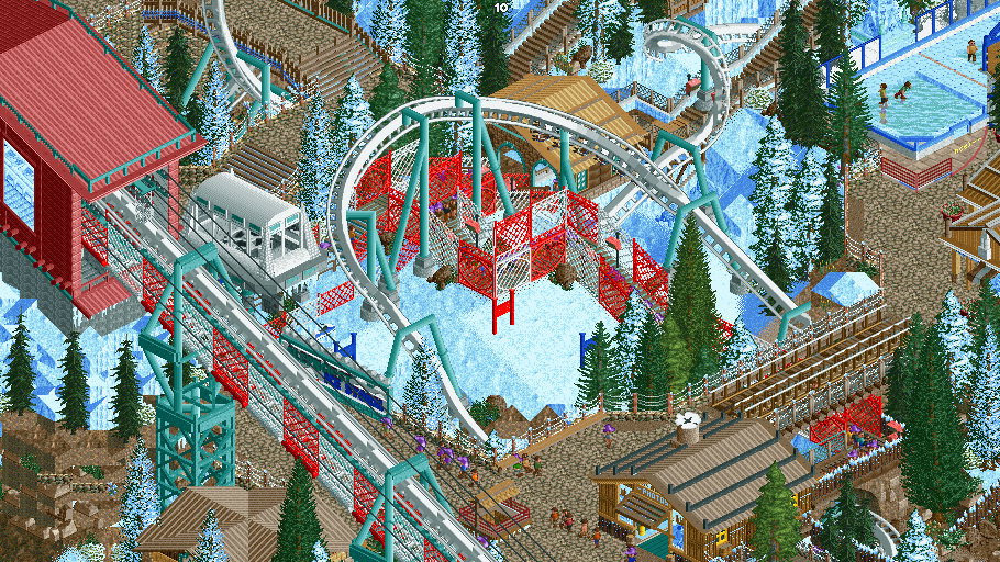
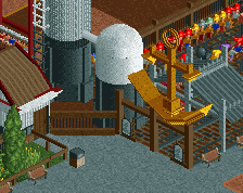
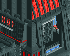
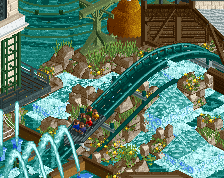
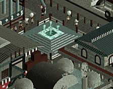
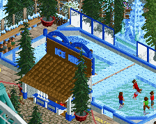
Been spending an age finishing this coaster. its also been difficult getting screens with only the entrance palza done. However Iv'e got a few screens of Alpengiest: Icestorm. Its located where black mamba is in phantasialand and its my mix of that and Alpengiest.
At least one more screen to come -
 Full-Size
-
 No fans of this screenshot
-
 Tags
Tags
reminds me so much of phatage's busch gardens sydney. chaotic and fun!
Love the colors and the supports look really nice.
It'll be interesting to see what you do with the overall architectural style in this area.
In German it'd be Alpengeist though, not Alpengiest. Geist means ghost.
Nice as always. Still think you need to clean up your composition a bit. That clump of white and red fences in the middle doesn't look so nice. The idea is good, but I don't think it works on very curved path that also goes up and down at the same time.
Super cool that you're reimagining black mamba like this. And from the looks of it you're also doing a decent job at implementing the pathing in a similar style to how it is over there, that was my favourite part when I visited. Really excited to see more of this project
I agree with Posix here.. that red/white fence probably isn't necessary.. or at least maybe try different objects? Seems a bit busy at draws your attention to that cluster of fencing. I'd rather you pull the viewer's attention to the banked turn and open up the area around it to have it stand out more against the background.
looks great. The netting on the lifthill is unusual but works well i think. That pool looks freezing haha
I'm not a huge fan of the red and white queue fences, in a way they're drawing attention away from the rest of the screen. I do like the red and white on the catwalks though. And everything else looks phenomenal! Alpengeist is easily a top 3 invert, stoked to see this in action.
Absolutely agree with CF101, the queue fences are way too bright, I see what you were going for but the red is just way too bright for this. Same with the fences on the invert lift hill, everything else looks awesome though.
wow i loved