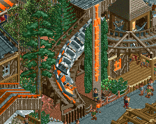
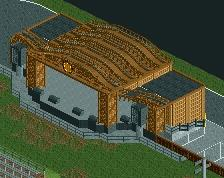
But it's so cramped into a corner. I think it really has some macro-issues. I think you need more focus on composition, though that is a hard thing to do. Anyway, don't put a big concert stage in a dark corner of your park.
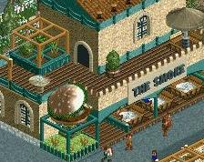
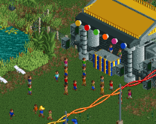
Definitely a great color scheme with some clever details thrown in. Some of the WW/TT objects seem out of place, particularly the sandy pillars and the rusted roof; with bold solid colors paired with black and white, these busier earth-toned items do not really fit (though you might be able to successfully integrate the pillars into the building if you only make them as tall as the door frames).
 23-March 21
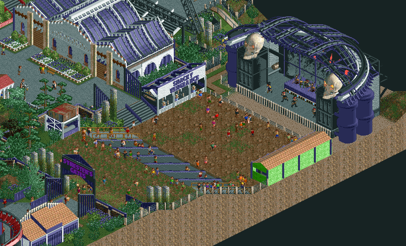
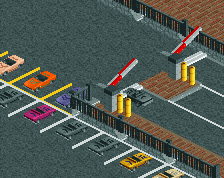
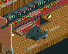
Cool stuff! Some bold color choices!
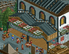
The stage is lovely! Love the gate too.
But it's so cramped into a corner. I think it really has some macro-issues. I think you need more focus on composition, though that is a hard thing to do. Anyway, don't put a big concert stage in a dark corner of your park.
that's a really nice stage
Snacky Vengeance oh my god
Definitely a great color scheme with some clever details thrown in. Some of the WW/TT objects seem out of place, particularly the sandy pillars and the rusted roof; with bold solid colors paired with black and white, these busier earth-toned items do not really fit (though you might be able to successfully integrate the pillars into the building if you only make them as tall as the door frames).