Screenshot / Zaccanapoli IV
-
 19-March 21
-
 Zaccanapoli
-

 4 of 4
- Views 1,460
- Fans 3
- Comments 8
-
 Description
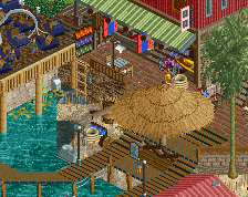
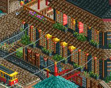
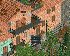
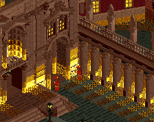
The last time we visited, the carnavale season was in full swing. It's been a couple years now, and since we're out of season, the streets have probably taken back their usual look. I also hear the freshly painted roofs from then must now have taken a more sober, darker hue.
Can we visit again? We didn't take enough wine back with us last time. I can already hear the church bells toll from behind the hill. -
 Full-Size
-
3 fans
 Fans of this screenshot
-
 Tags
Tags
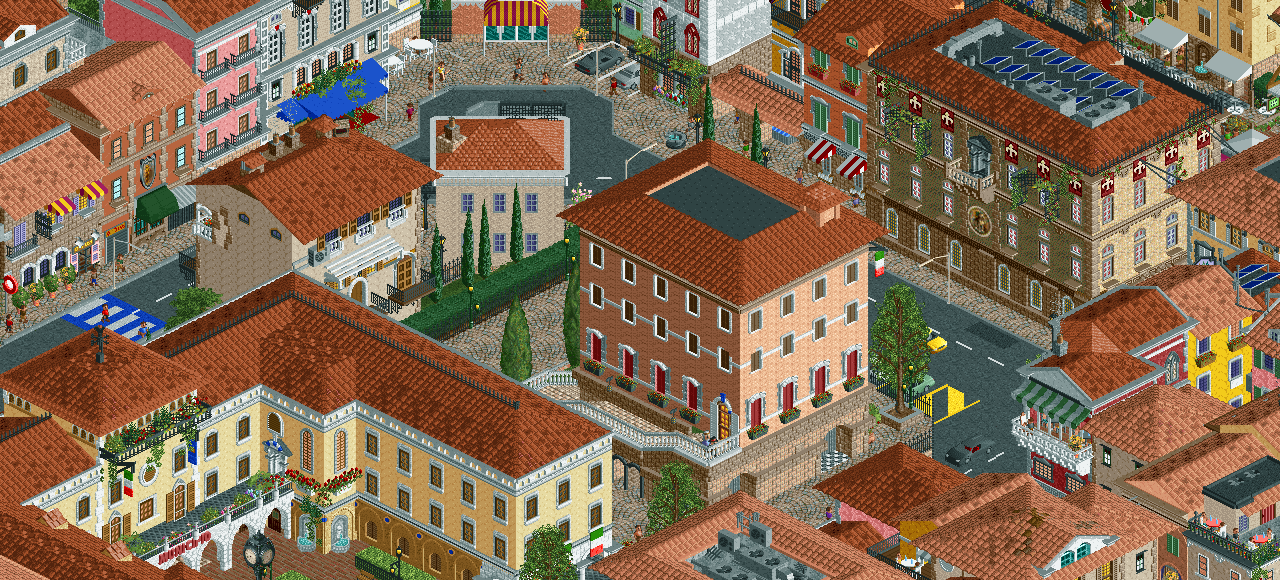
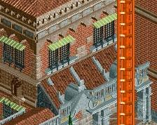
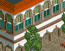
This is amazing, Zis! Really nice. I really love the building with the solar panels on it and the white one with the blue awning.
I think that the 2 big buildings in the middle can use some more details, some balconies or random hanging planters. Maybe you can also add some more chimneys on the roofs
Have seen this a million times now, but still manages to blow my mind.
Looks great, beige building in the middle stands out a bit. I'd either use a different texture or add some details.
Should've been in Grand Tour. Nice work.
Hell yeah love seeing more of this. Good to see you back Zisc
Thanks a lot guys! I'm hoping the simpler big buildings will make sense in context of the whole map, because a majority of areas are very dense and detailed. I'll try experimenting to find a balance.
Hit many firsts with this section, like big purpose buildings that aren't small hotels/restaurants/cafes; roads; etc. Still struggling to make things look natural, but hoping it'll get there. Or at least close enough to there.
Godlike.
wow