Screenshot / Dreamworld - Central Commons
-
 16-March 21
- Views 3,056
- Fans 10
- Comments 26
-
 Description
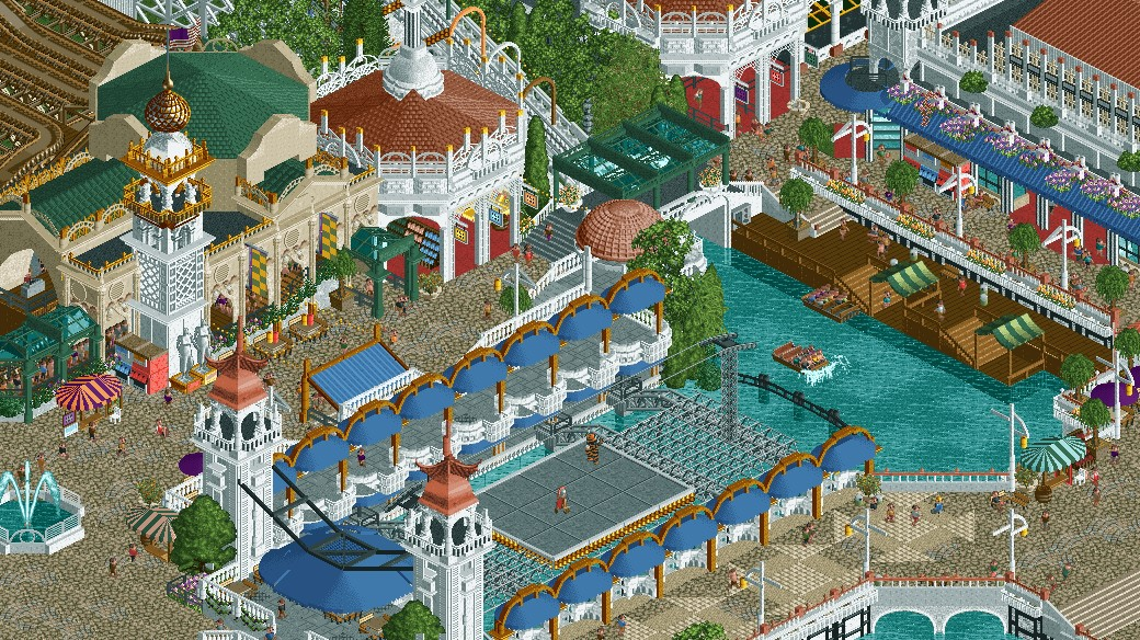
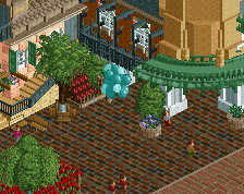
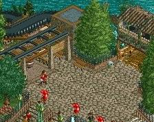
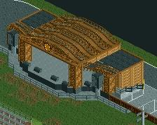
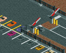
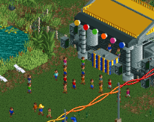
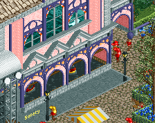
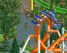
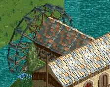
Been working on a new project for the past month that's set in the 1920s. Inspired heavily from Coney Island, and other Northeastern US parks from that period. Pictured is the central commons area where guests can ride the Chute the Chutes water ride, Virginia Reel, or watch Hagenbeck & Wallace perform.
-
 Full-Size
-
10 fans
 Fans of this screenshot
-
 Tags
Tags
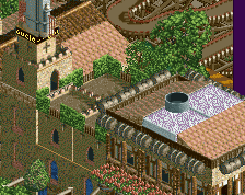
Hexagonal building's second floor is a little plain as far as walls go, but everything else looks great - love this park style.
Jesus! This is is spectacular. Love the 20s setting. Did they have vending machines like that in the 20s though? Christ.
This is crazy good, getting major 20's and world's fair (the real one) vibes from this. Not a huge fan of the path at the bottom right of the screen, and the wooden docks by the water need a bit of a touch-up in my opinion. That I'm nitpicking this hard speaks loads about how good this is.
wow great screen! I'm looking forward to see you recreate all these old rides.
Yup, this is awesome.
Oh wow
yeah this is just wow
Easily your best work, this is phenomenal. I've always wanted to see someone execute a park like this and I don't think anyone could execute it better.
that portrait painter is such a nice detail
Honestly gorgeous. Archy is detailed but not messy, despite the occasional glitchyness. Perfect palette choice.
Wow that's fantastic. Only thing I would suggest would be to detail a bit more the underwater of that lake/water ride. Also it hurts my soul to see those boats half full, for aesthetic reasons I can only appreciate them when they're full, but that's probably just me haha. But for some reasons it impacts the effect that screen has on me.
Otherwise it's gorgeous congrats !
RaunchyRussell Offline
Damn. Yall came out dicks swinging on this one. Phenomenal stuff.
Fantastic as you know, only thing i'd change is the vanilla canvas tent awnings at the docks, they seem a bit dissonant with the rest of the screen to me.