Screenshot / Universal Studios Seoul - NYC
-
 15-March 21
- Views 4,148
- Fans 7
- Comments 22
-
 Description
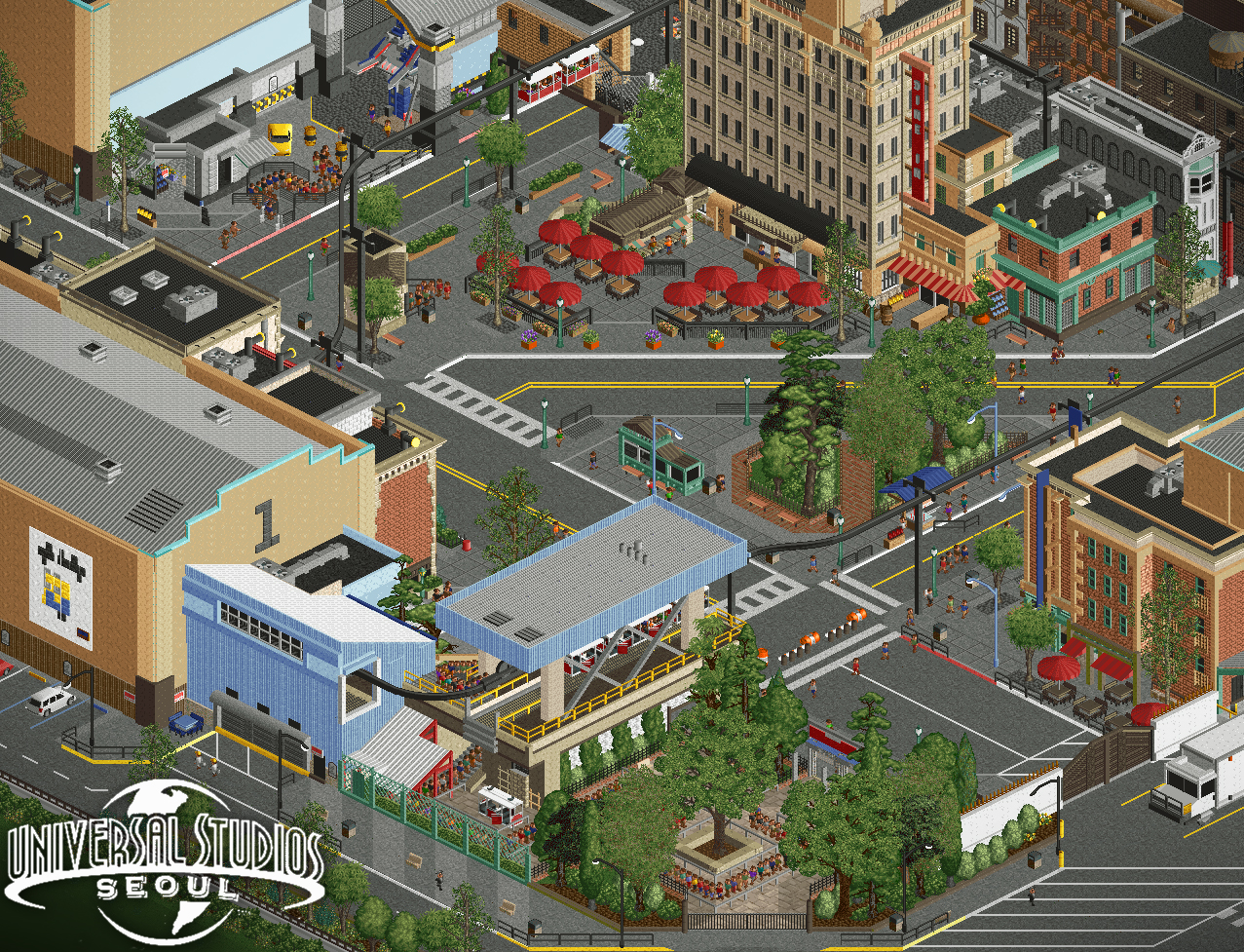
Welcome to Universal Studios Seoul!
Featuring:
- New York City Tram Tour: KONGfrontation (station)
- Transformers (Optimus Prime & Bumblebee( Meet & Greet
- 55 Central Bistro (table service)
This area rounds out the NYC section of the park. I figure that since it's been almost a year since I've posted a screen of this project, I might as well show you what I've been working on for the past couple weeks. Prior to this month, I haven't touched this project since well before the Grand Tour contest lol.
Aiming for a nostalgic Universal park feel, while also featuring some new rides and attractions.
Josh -
 Full-Size
-
7 fans
 Fans of this screenshot
-
 Tags
Tags

Could stare at this for hours, I'm in love. Glad you've picked it up again!
Amazing screen.
Seoul? I thought it looked Spanish. Amazing work either way.
damn is that a minion poster
beautiful
unfortunately
I love minion me me s
Absolutely great, love the openness besides the tall buildings. Only eyesore for me is that tall tree in the center whose leafs look like radioactive candy cotton.
Also I think that truck is too much off scale (which other than that is perfectly on point imo).
fantastic screen. this is exactly how i expect a theme park version of a city street to look
Obviously insanely good, but for the love of all things holy just change your tree colors, man.
that transformer is insane, so many little details everywhere too. looking forward to the rest
This is sick! The transformer photo op is done so well. Its like the perfect mix of a studio and actual city. Love the suspended monorail, killer.
Love everything about this
Love this - so immersive and crisp. Everything looks just right in this screen - except for that monstruous white truck, it's definitely too large, especially when compared to the standard car objects you're using. Going down to 1/4 size might be better, even if that might be a bit smaller than the ideal size.
Btw, still should rename this UniverSeoul Studios....now's your chance!
perfection
Looks so great ! I want to see more !