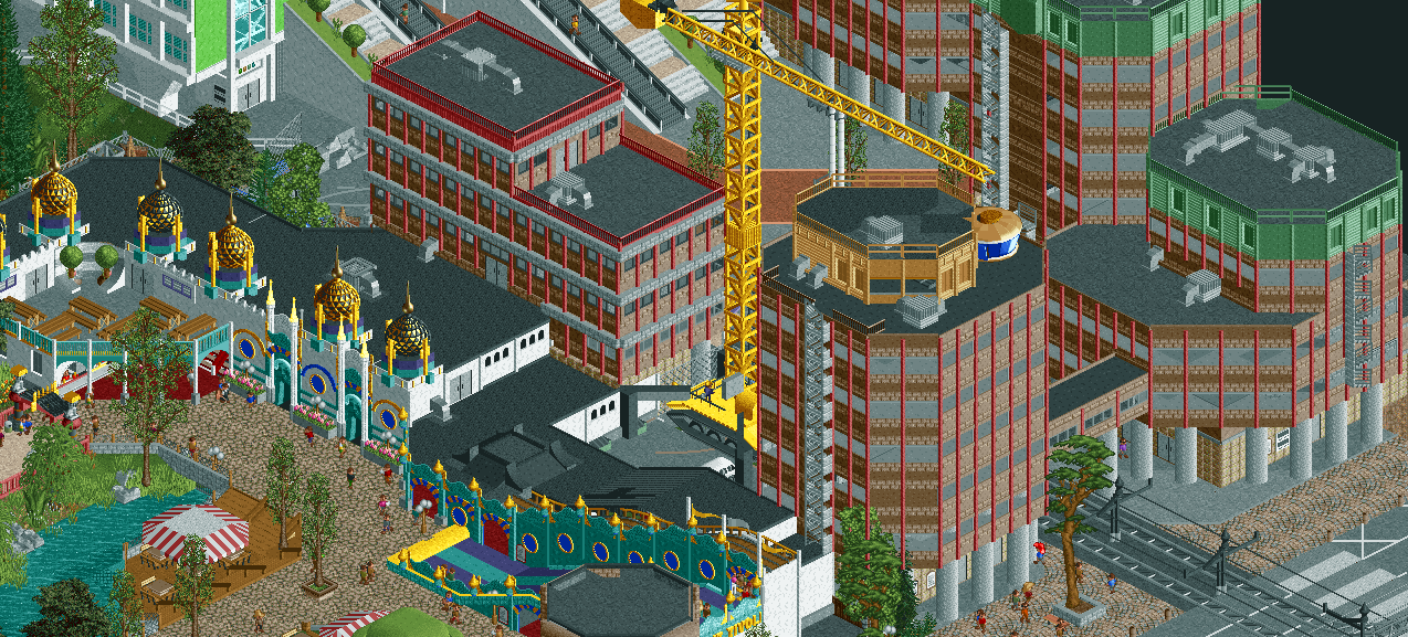
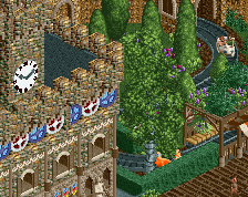
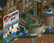
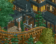
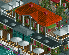
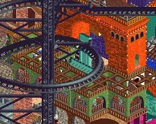
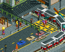
Screenshot / Gildenkwartier aka Purgatory
-
 14-March 21
-
Urban European Adventures with Faas
-
15 of 18
- Views 1,572
- Fans 1
- Comments 14
Community Forum Software by IP.Board
Based on this place:
https://www.emporis....om-stadsplateau
Wow, those are hideous. And real.
I think this is spectacular. The proximity to the tacky theme park architecture is a bit unfortunate, it's missing some kind of transition. But then again, that is kind of fitting, as these things are placed without any regard for existing urban fabric or the human scale.
Amazing work. I love it.
excellent per usual
Stark contrast, but I love it
RCT wise it's not bad, but I'm not getting the Gildenkwartier vibe. Why did you use 2 different textures (brick and marble)? I think the use of one texture (castle wall texutre?) would make it look more like the real building. Would it also be possible to round of the tops of the buildings, like they did with the real thing?
well there's a mediamarkt in one of them, for starters
really like this, its a different side to you and your work, but it still stays true to your cute style
ugly, looks great.
I agree with Sulakke's points
wow beautiful
RaunchyRussell Offline
Ugly is Beautiful. Love it.
Really looking forward to this, for me your best work. I love how close those blocks are against the park.