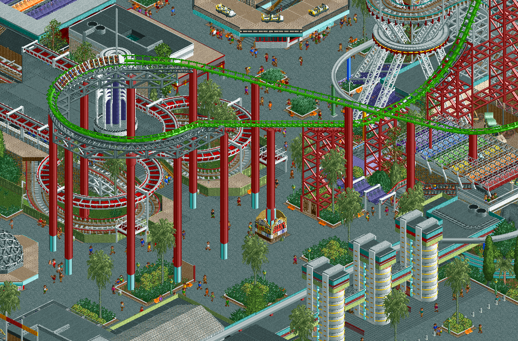
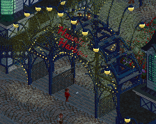
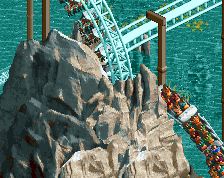
I'm not sure I'm feeling the bright green track when compared to the color scheme of the rest, but I can't get over how nice the Grand National main ID sign looks. It's absolutely incredible.
colours are definitely something I'm finding tricky here. Usually I go for very limited colour schemes and a cohesive look in the classic NE style, but for this I'm trying to step out of my comfort zone and go deliberately eclectic and chaotic, but still make it look good which is quite difficult.
Still though, between this and Lew's Blackpool he posted on the Discord, imma let mine rot.
don't do that! I'm sure the projects will look totally different
 13-March 21
nice idea how fast you build everything in NCSO/CSO and co
crazy =)
Holy fuck
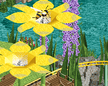
hot
this is beautiful, ncso is thriving
Got bored of their Tivoli projects
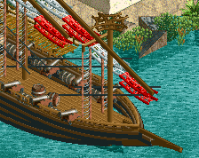
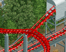
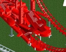
The individual tricks are cool, but I'm not gelling with the colours 100%, but I can't pinpoint why. Maybe it's the dominance of the red and grey.
Still though, between this and Lew's Blackpool he posted on the Discord, imma let mine rot.
Wow. This is incredible. Everything looks so good. Probably one of my favorite screenshots ever (I say this everytime but still).
What the fuck is wrong with you?
Agree with Robbie a bit. Maybe it's the grey? Think the path is too dominant. Hard to help it without CSO I'm afraid.
I think maybe there's one too many dull colors; gray, dull green, dull brown, dull red - I think if you swapped one out or combined two it'd help.
I seriously love this though otherwise. I'm much more interested in seeing this as a whole than I am concerned about the colors.
alex it is too grey
I'm not sure I'm feeling the bright green track when compared to the color scheme of the rest, but I can't get over how nice the Grand National main ID sign looks. It's absolutely incredible.
RaunchyRussell Fan Offline
Damn. Save some RCT for the rest of us. Incredible stuff.
This might actually be it for me too.
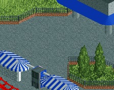
good macro, you really have knack for doing the deco modern look
thanks for the comments!
colours are definitely something I'm finding tricky here. Usually I go for very limited colour schemes and a cohesive look in the classic NE style, but for this I'm trying to step out of my comfort zone and go deliberately eclectic and chaotic, but still make it look good which is quite difficult.
don't do that! I'm sure the projects will look totally different