Screenshot / Six Flags Challenge Woods
-
 23-February 21
-
 Speed Building
-

 2 of 2
- Views 2,515
- Fans 0
- Comments 12
-
 Description
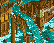
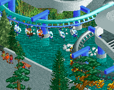
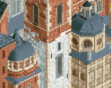
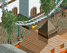
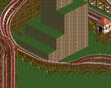
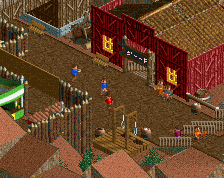
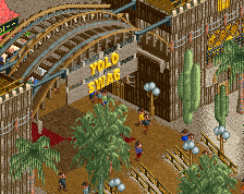
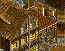
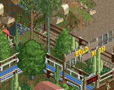
Maybe the nicest area in the park, thanks to RWE's architectural contributions. Park has been submitted!
New park name too, 'Great Job' sounded too dumb. Challenge Woods also sounds dumb but at least it makes sense as a park name and the park is both a challenge and set in the woods, so fine. Naming it after a US state or place would've been too hollow. -
 Full-Size
-
 No fans of this screenshot
-
 Tags
Tags
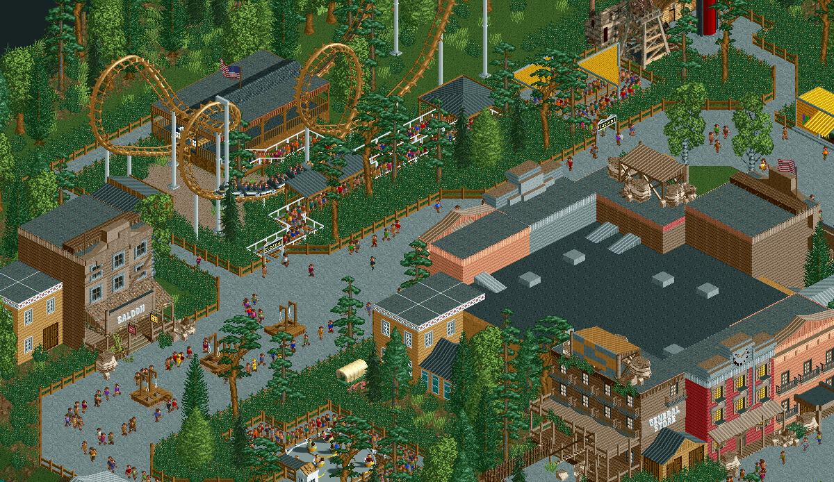
This is surprisingly decent, I think the archi is doing a lot of the leg work.
I still love that shrub object.
While that shrub is a good object, theres a tad too many of them in this screen without any variety!! With the scenery manager I'm surprised you didn't make an underbrush 1x1 or 2x2 like your cso underbrush objects
I think with even just a dash of flowers or slight path switch up to something more textured, this would honestly be quite good. Just because it's Six Flags doesn't mean it's a colorless void of tarmac.
The objects are positioned that is harmonious good good
i sorta like the overwhelming blackberry bushes. gives it a vibe
love a good bush
Looks nice, but why are there rocks on the roof?
Gotta trim that bush around the queues.
Needs less Six Flags, needs more shrubs.
Screen is clean, but uninspired