Screenshot / Sidney park
-
 09-March 14
- Views 1,834
- Fans 0
- Comments 14
-
 Description
i'm quite far in this current project (16 hours) and the park will be called "Sidney Park", as it's an anagram to disney. this will kinda be a parody on that because the Big thunder mountain will be called "grand lightning hill" and the spacemountain ride will be outdoors and be called "Olympus Mons" (don't worry it starts in a building).
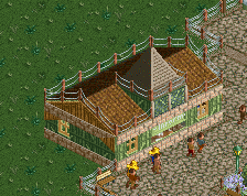
the blue building on the right will most likely be deleted as i'm not too fond of it, and maybe the one with the green towers (still got some detailing left there).
anyhow i'd love to hear you guys suggestions! -
 Full-Size
-
 No fans of this screenshot
-
 Tags
Tags
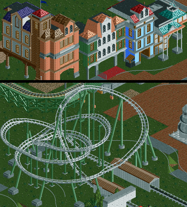
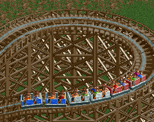
The coaster is nice, but could do with being a bit longer. The general flow of it is nice though.
The mainstreet architecture is looking good, just need some details to stop it looking so flat faced.
Yeah, what Louis said.
The coaster is entirely right turns, which I don't really like, but it still looks nice. Ditto on the flat buildings.
how do i do that? adding balcony's to the white and pink building? because right now that seems like a good option
Yeah, add balconies, flowers, canopies etc.
Most of the buildings are fine, I just mean the plainer ones. They could do with some definition from deco pieces and poles and posts etc etc. Not necessarily balconies.
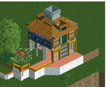
is this better? i made a restaurant and with a gate to seperate it from the street, also i added bycicle stands and balcony's
It's better, but that white and green building still needs some work on the white part.
Try to see a set of buildings as a whole, instead of a cluster of individual buildings, if that makes sense.
how do you suggest i do that? right now i like the bottom floor as it is, but for instance in the floors higher up i agree there's still some work to do
Try to make aspects of some buildings come back in others, to create a sense of flow. It's like mixing songs together, you put the songs that have the same tempo or tone next to each other.
Also please rate my screenshots, they're never rated
All the stuff going on in front of the green/white building is really cool. Glass fence, bicycle racks, planters, even the awning fits in remarkably well. I can see myself having a drink there.
Keep experimenting with the architecture, eventually you'll find out how to achieve cohesion and flow. It's a matter of trial and error.