Screenshot / Tornado springs area
-
 20-November 20
-
 Conway Castle
-

 9 of 12
- Views 1,807
- Fans 0
- Comments 8
-
 Description
Hey peeps,
had this screen in the locker whilst I'm finishing one of my bigger coasters.
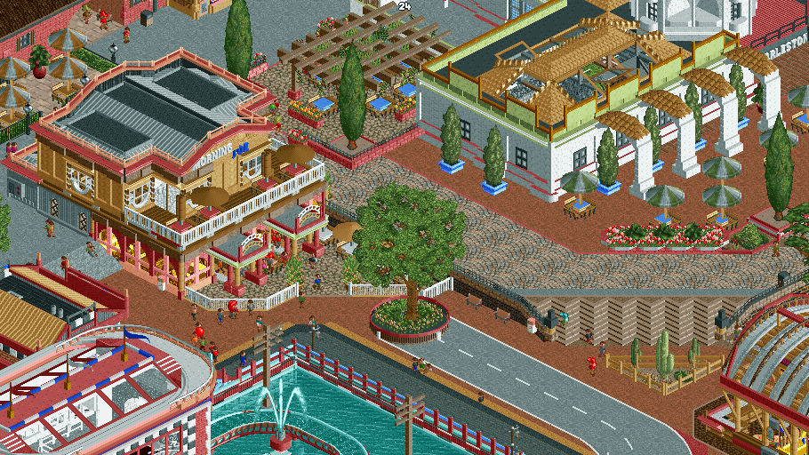
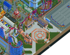
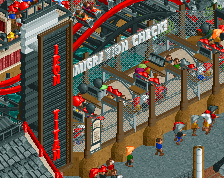
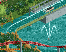
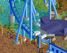
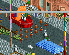
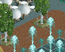
This screen is of the edge of the main plaza of tornado springs area. With morning Joe coffee and Flashback's station. Also there's a stand alone restaurant, The Charleston Circle. Sorry its not really centering on anything, just wanted to show new stuff.
new coaster coming soon -
 Full-Size
-
 No fans of this screenshot
-
 Tags
Tags
Gotta give theflowdiskord some love here fellas!
This has your signature style written all over it. Really like the Morning Joe coffee shop in the middle. It'll feel more lively when you get more peeps running around.
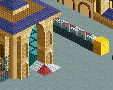
The building in the top right seems like you have a cool concept with the glass roof, but it feels a little off at the same time (maybe it's the castle wall object, not sure). Maybe play around with it a bit more. I assume the cactus' are connected to a desert area off the right side of the screen?
Either way great work... even if it's an "in-between the good stuff" screenshot
Great stuff. Only thing I'm puzzled by is the road that dead ends into a tree. Morning Joe looks awesome though
This feels a lot more harmonious than your usual work, good job. The red path is throwing me off a little bit, but other than that, looks good.
cheers man, bit of a filla screen tho! The tornado springs is going for a 1950's mid west vibe. Think I will change the red path by the restaurant so the difference between the areas is clear.
almost finished the next coaster
RaunchyRussell Offline
I definitely am digging where this is going. Cool archy.
This feels very much like harmony through chaos, which I think is working in some places and not in others. It kinda depends on the context of the park. If the goal is to get a sort of thrown-together look, where new things are being built on top of the old, I think that comes across. The architecture and detailing is good, if not a bit over the top in places, and I like the general atmosphere.
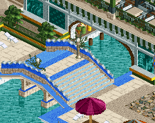
But, I think an editing eye and a focus on creating a bit more unity across individual areas could help a lot. For example, you have over 10 path types visible in this screen, and you haven't used the same fence type in any two places. Finding a few types to weave throughout as a visual motif should help create a better sense of unity.
Even though this is at a crossroads of three different areas, I totally agree with your criticism and will read carefully. Cheers!
every screen that I see always a pleasant surprise and seeing the capacity for imagination inspires me. very good indeed.