Screenshot / Forbidden Desert 2
-
 04-November 20
-
 The Conquests of Quinlan Quinto
-

 9 of 10
- Views 2,746
- Fans 1
- Comments 13
-
 Description
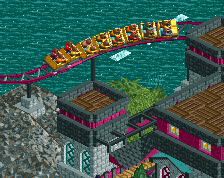
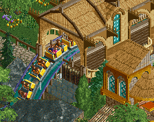
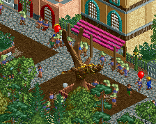
In celebration of my 300th Year of construction, here's another screenshot of the Forbidden Desert. (Though I build in Pause mode so much, it's probably like year 400-500).
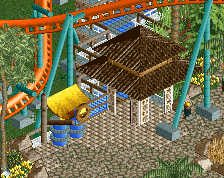
Features coaster supports from CP6.
Hoping to get this done in 2020, but it's possible it could be an early 2021 release. -
 Full-Size
-
1 fan
 Fans of this screenshot
-
 Tags
Tags
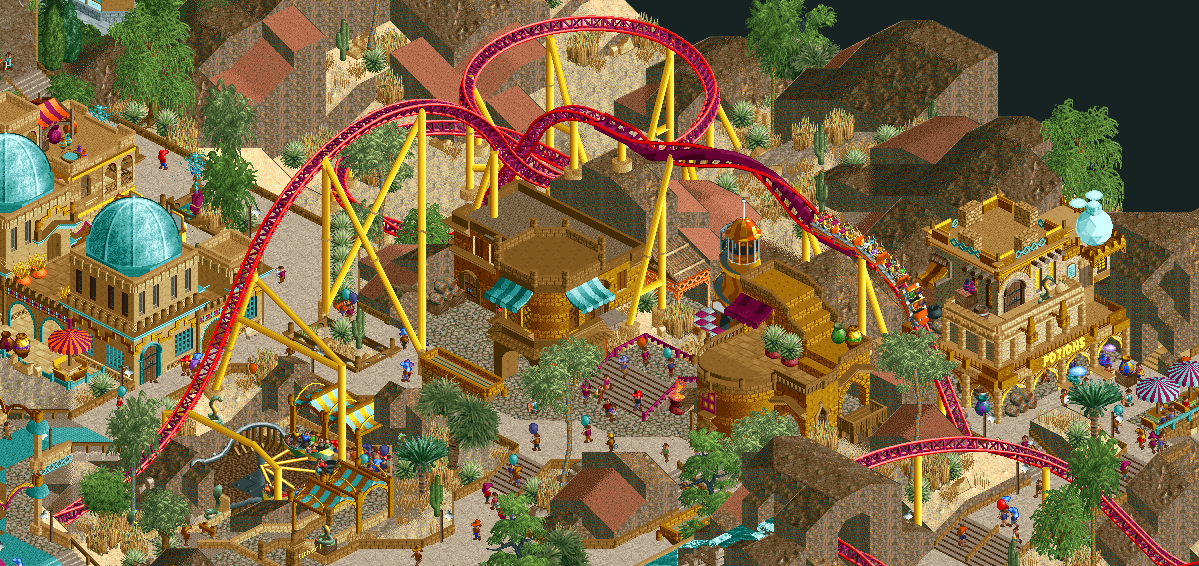
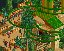
I get some Zula vibes with this. Very nice - like the macro landscaping but I do think (might be framing here) that the tunnel you've got at the bottom could use some elements of rockwork etc to break up the vertical face a little bit. Other than that, you might want to add some benches and lights to spruce up the paths. Like the vibrancy and interaction of the ride with the rest of the area.
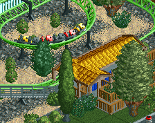
Cool screen, a lot of atmosphere going on there. I think the coaster would look better if the rails are all in the same purple color. Good work Gill!
I really like this a lot. I think it's one of the better screens from this project for sure.
Living up to the "This is no theme park, this is an adventure!" slogan from the project page with this screen. Think there is some room for improvement in smoothening and refining the jagged landscape, but generally this screen is awesome and makes me really excited for the park.
Pretty sweet, feels exciting. Wish some of the rooves and bare areas were more interesting, they just feel a bit unfinished.
RaunchyRussell Offline
Very cool atmosphere here! I like that you have the footers incorporated into the theme as well.
I really like this, it seems an improvement in clarity and form for you. The whole space feels more organic.
The gold buildings stand out gorgeously and I love some of the teal elements too. The bright red coaster rails aren't doing it for me however, too highly contrasting.
Thanks for the constructive feedback, I've made some tweaks, including adjusting the coaster colors to be uniform as Fred suggested.
Looks sort of like Kukuana meets El Encierro.
The landscape could use some tweaking but awesome for the rest!
Not really a fan of the 1/4 height brick walls you use to border your paths. Just feels a bit plain to me.
Interested to see how this all comes together, quite a bit of variety here.
This Forbidden Desert 2 is very beautiful