Screenshot / Orchid Hidden in the Forgotten Temple
-
 27-September 20
- Views 2,480
- Fans 0
- Comments 19
-
 Description
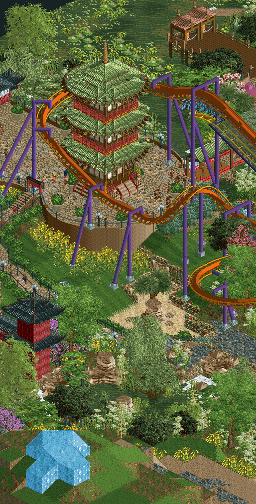
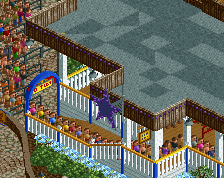
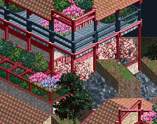
Will you be able to maintain balance as twist and turns await ahead. Orchid, an invert roller coaster, winding its way through a journey into a spiritual landscape.
A temple has decides to create a roller coaster in hopes of drawing more guest to the region, please remember to leave donations in the shrine box. -
 Full-Size
-
 No fans of this screenshot
-
 Tags
Tags
not a fan of that water. Makes the scene way too green.
nice roofing
I quite like it but those supports on the first drop will kill the peeps and destroy the trains...
+ Love the round roofs
+ The round platform with fields below and coaster above is very pretty
+/- unbank the drop to fix Fred's issue
- Don't like the palette
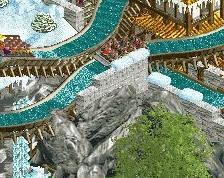
I want to echo what people have said. Particularly Scoop's comment about the water. Didn't realize that was water at first.
wait what are you doing to get that water
The pagoda, the coaster elements, and the landscaping in particular are great. Particularly the variety right below the pagoda.
I agree about the knee-breaking supports. I kinda love the look of the green water, but I agree that it gets a bit lost based on some of the other choices in this screen. And, of all the unusual water color choices, green is the most offputting. I'd try something similarly bold but less associated with bile.
I think this isn't the best angle for the green water; other angles do it justice much better.
#draintheswamp
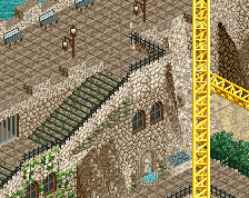
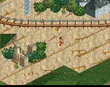
I think overall the screen reads quite hapazardly. The combination of land textures (mowed grass, unmowed grass, sand, green water, dirt, dirt +grass, stone, ice) is overwhelming and patchy, and the foliage does not help in blending in a lot with the surroundings especially with the green water. Some refinement in the landscaping would greatly help bring together the surroundings.
This is great, I love the water! Don't listen to the haters.
The supports need to go though.
RaunchyRussell Offline
I like the green water, ground textures need some love, and maybe integrate the supports into the the building. Idk I'm into it.
Love the water! And the way the drop dives into the corkscrew, its short but I like it.
This would be beautiful if there was no coaster. Looks like it's just been forced into a really nice scene.
I'm liking this a lot actually. Really enjoyed your progress on this. I'm not sure about the green water though, it blends too much with the land IMO.
I dig the green water, and the pagoda is great. I think the coaster would look way better of the supports on that first turn would be on the inside of the track instead of on the outside
Tried to add a more defined border between the land and water so you can tell them apart, this screen pretty vertical can be a bit jarring i agree. The supports have to be on the outside unfortunately without going through the structure. I added some space so it doesn't look like it will clip anymore .
I think the green water really adds to it overall, as in final product.
Yeah keep the green water, it looks dope.