Screenshot / Railgun
-
 10-September 20
-
 American Fuji-Q
-

 5 of 8
- Views 4,203
- Fans 5
- Comments 13
-
 Description
Opening in 2002 as the fastest accelerating coaster in the US, Railgun took the success of Hypersonic XLC and ran with it. Launching riders from 0-90mph in less than 2 seconds, Railgun's launch is a force to be reckoned with! Silver Lake made do with minimal space, and wrapped Railgun's high speed turn around over and around the water park.
-
 Full-Size
-
5 fans
 Fans of this screenshot
-
 Tags
Tags
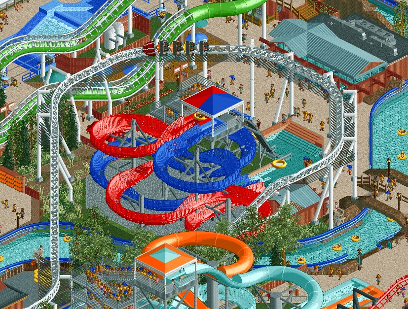
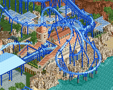
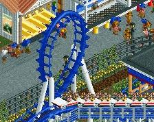
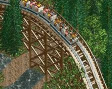
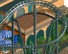
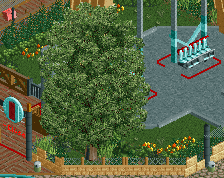
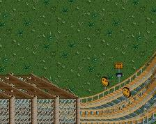
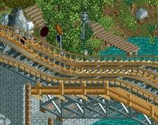
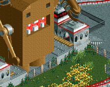
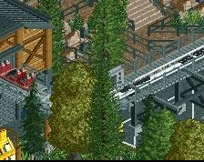
There it is! This is a great visual moment for the park. Really get the sense of a crammed park that just built a coaster on top of everything else, and there's just the right amount of detail to really sell that. The shapes and composition within this screenshot are phenomenal too. This screen has definitely piqued my interest more so than anything else you've shown, and I hope more of this quality gets carried through the park.
Yeah dude this is awesome! no complaints really. Maybe add some trashcans? lol
Wow! water coaster looks neat!
Oh I'm enjoying this quite
Definitely the best screen you've shown of the park. The coaster looks sick.
The long pale looking grass, exposed mud, and the amount of trims, nets and rails suck all the atmosphere out of this, but I can't fault it on a technical level, and I love seeing obscure/rare coasters in RCT. This park is definitely going to be a treat!
Interesting roller coaster design. As of today, it has probably been reviewed and rated by users more than once. Maybe it's a classic or maybe the original?
I like.
I'm on the same page as Liam, although I don't mind the grass/trims/nets. The exposed mud bordering the lazy river and the bridge completely kills the atmosphere for me though. But like Liam said, on a technical level, absolutely great.
I always love to see these kinds of coasters. You couldn't have picked a more depressing backdrop though.
I also agree with Liam, I think in general the colours are quite bland and I think this is because there is a lot of grey in this screen. Maybe consider adding some colour or extra details.
A change that would maybe already make this nicer is to make the grey cobblestone path underneath the red and blue slides brown.
Overall this is still pretty good though.
I love this.