Screenshot / Canary Mines - The Explorer's Refuge
-
 06-September 20
-
 Canary Mines
-

 4 of 4
- Views 2,694
- Fans 0
- Comments 21
-
 Description
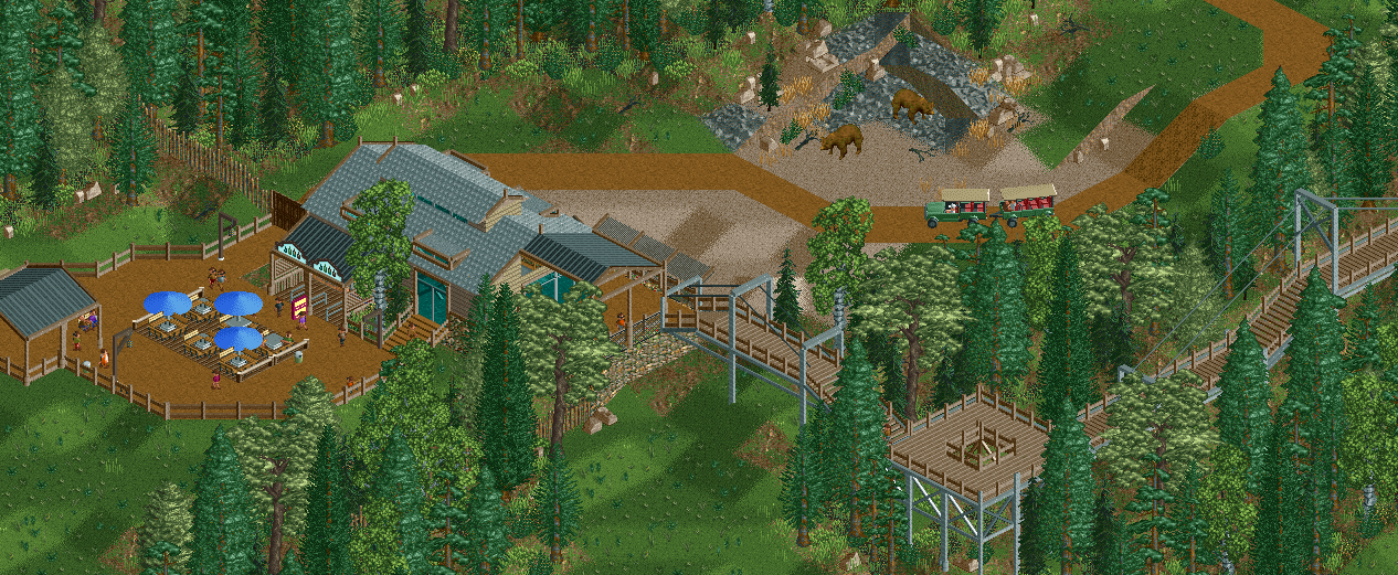
Part of the Canary Mines Society is the Canary Mines Nature Reserve. This vows to protect the wildlife and let it roam free in the mountains surrounding the old mines. Visitors can explore this area thanks to a modern walkway through the trees or on board a safari truck. At the half way point, there's the Explorer's Refuge, a place to picnic and admire he views.
-
 Full-Size
-
 No fans of this screenshot
-
 Tags
Tags
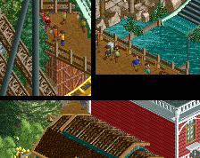
I like it a lot, especially those bridges you made there! One thing I do suggest is adding some flowers next to the little terrace to separate it more from the path. It will also add some color.
Love those bridges. Seems like it would be a great place to take a walk.
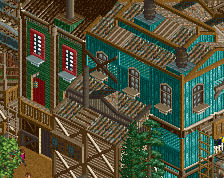
Would agree with others on roof color-- perhaps black becomes flat red or something with a bit of color?
Love the aerial walkway, super fitting.
Sweet stuff Jappy.
I always find these bare diagonal paths unnecessarily harsh though. Can you soften the edges somehow?
Ooh, love the safari jeeps.
I think it's too clean. Nature isn't this organized. More tall grass and rocks would rough it up if that's something you wanted to do.
I will be waiting for the better NCSO version
But seriously, it is good stuff and I agree with the others; rough it up a bit at places if you want to complete that 'outdoors' feel.
I'm not a fan of these roofs yet. Lower the black ones, color them red, doing both things would do the trick. Both textures need to be more seperated at least.
The walkway is really cool. Might we worth putting some signs or information boards on it, just to add some extra detail and interest. Agree on the point about the brown roadway, perhaps try and make it look more like a rough dirt track rather than a perfect road.
^this is great advice, have it feel like a trail with info over just a walkway, think things through a little more when it comes to functional details as they really help sell the idea
Hooo very good, nice bridgies
It does what it was set out to do, but not much else. Like others said, definitely try to add more detail to make it more organic instead of organized and rigid.
One thing that comes to mind. The fact that is bears, when they have a reason can be really dangerous. Which would suggest that the mesh fence would extend a little deeper into the forest. Not to say that in my opinion this fence should be flush with the edge of the road for the vehicle.
I really love those bridges!
Love the shape and form overall for both the bridges and building. Personally i'd lay in an accent color to liven it up, but i'm prone to color so take that with a game of salt.
I agree with others on the safari ride path. Assuming it is a dirt path and not paved, i'd use some 1k nets and flat roof pieces to soften the edges a bit. Similarly with the foliage, could use some different shades of green and brown to add some crunch.
ALL that being said, love the direction here and really excited to see this park!
simply stunning