Screenshot / No-Hacks Invert
-
 29-August 20
- Views 1,532
- Fans 0
- Comments 5
-
 Description
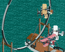
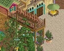
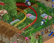
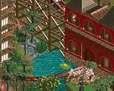
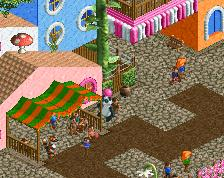
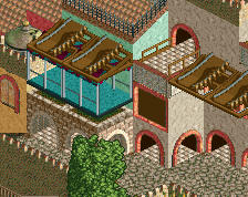
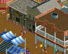
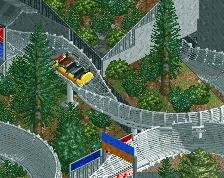
I still play this game sometimes. Decided to try the simplest, streamlined approach possible to give myself the best chances of finishing a full scale park. Build Your Own Six Flags scenario. No hacks used. As vanilla as possible. Having fun so far, little by little.
-
 Full-Size
-
 No fans of this screenshot
-
 Tags
Tags
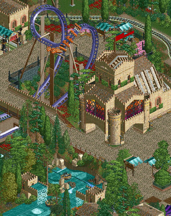
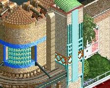
What if you make the corner turrets taller? I feel like they should rise above the middle sections. May also solve some of the issues with the walls being incredibly thin and flimsy looking there.
Lovely stuff. The rapids theming looks great.
Something like this Liam?
I like the composition and the way you've built this area around the cobra. The color choices are good, but the brown tone is really prominent so any ways you can accent or add more color I think will help. The stained glass treatment helps and I think looks really good.
I would make them even taller (add maybe like 3-4 units? Or even double them in height from what it was initially), but this is definitely better!