Screenshot / Quake(r Steak & Lube)
-
 28-August 20
-
 Otterdale Gardens @ Lockdown Lake
-

 2 of 7
- Views 1,378
- Fans 0
- Comments 6
-
 Description
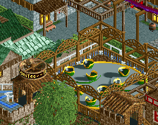
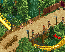
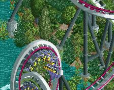
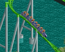
This is the same park I posted screens from last time but it's a different section that's all jungly and stuff. This coaster is called Quake and it's got el-primo stats. I think my foliage has gotten better and I wanted to try making a ride that had some cool interaction with the paths and buildings.
-
 Full-Size
-
 No fans of this screenshot
-
 Tags
Tags
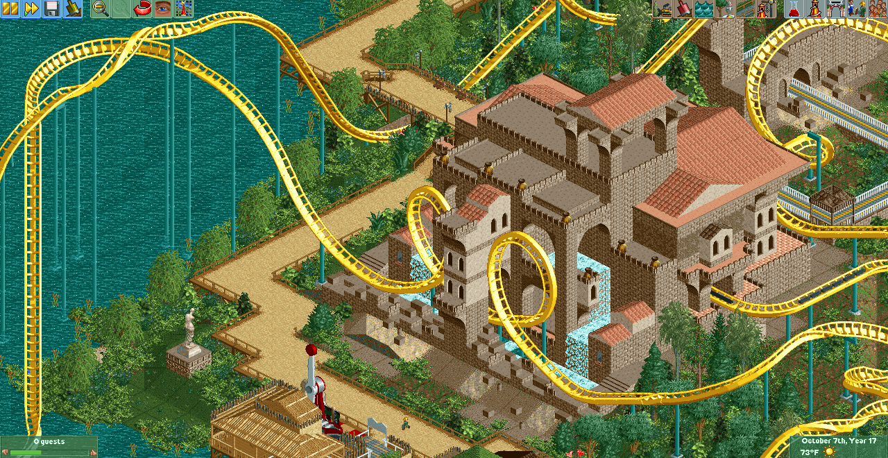
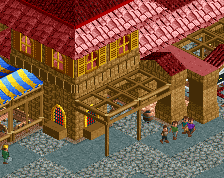
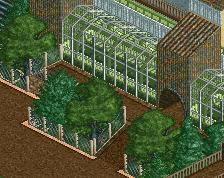
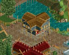
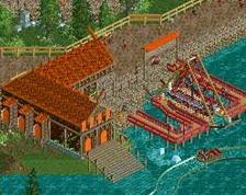


I'm a fan of large/boxy, and the arches here look nice. Is the double brake run for the station?
Heck yeah it is
Excellent! I love the vibe in this area. Maybe consider adding a couple smaller buildings with similar wall colors and same roof colors to tie the area together a bit more. Would also help break up some of the sharp path edges.
Always enjoy seeing your work!
I:C makes some good points, and I advise you to develop the coaster itself a bit more. Custom supports are not quite a must (especially the modern B&M supports, overrated!), but the way it's sitting on the water right now is just too simplistic and random.
Also reminds me of this.
https://www.nedesign...s-of-discovery/
Really excited to see more of you and see you improve.
I liked the roofs, I think it was very good