Screenshot / X-Sanity 3
-
 25-August 20
-
 American Fuji-Q
-

 3 of 8
- Views 2,594
- Fans 0
- Comments 16
-
 Description
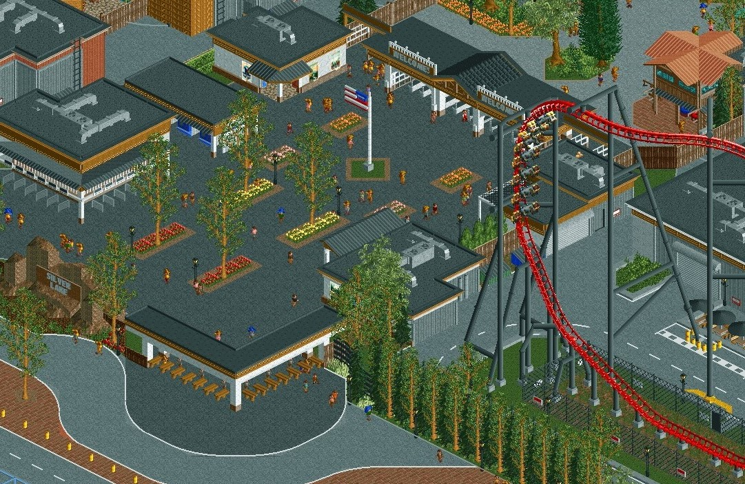
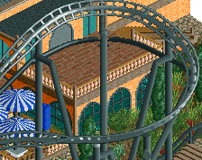
X-Sanity, opened in 2008, dominates over the entrance to Silver Lake Amusement Park. Silver Lake, often called the American Fuji-Q by coaster enthusiasts, boasts an impressive collection of coaster for its size and X-Sanity is the granddaddy of them all.
-
 Full-Size
-
 No fans of this screenshot
-
 Tags
Tags
thats a massive coaster, jesus
I like that you've gone for quite a low-key style with the entrance buildings, and the brown accent is working really well. I'm not such a fan of the dark grey paths here, it's a bit too close to the roof colour.
Coaster certainly looks cool, but the entrance area looks a bit too cool. Needs some warmth to break the sterility.
I like the cleanliness. I don't like the curviness in the bottom of the screen with the road lines, it doesn't fit the angular, more "tight" look of the rest of the screen.
I agree with alex about the colors, otherwise good work
I think this would be stellar if you replaced the dark grey tarmac with crazy path, or cena path.
Also, I hate the light tan tree trunks, they look so bad imo. Just make the standard light brown and it will look so much better.
Pretty much only critique is that the roof and path are the same color. If you could swap one out, that would help immensely with readability.
Comments addressed, check the screen below
Much cleaner dude!
I really have mixed feelings about this.
In terms of execution and detailing this looks great, but I struggle with the scale of it. The sheer size of the coaster and the huge expanses of pavement make the buildings seem much smaller and more squat then they are. If you squint your eyes, the thing that stands out most is the intense amount of grey, and the white/black/brown entrance buildings don't do much to distract from that. Personally, I think more landscaping, more color, more vibrancy to attract the viewer to this as an 'entrance' to the park would help. But I say that understanding that from a realism perspective, this is pretty true to form. So, as noted, mixed feelings.
Definitely an improvement, would still like to see a bit more color and stuff though. It is rather dull.
FYI you're missing a diagonal path piece at the bottom middle of the screen.
How about some lightpost or standalone banners? Vertical avenue-of-flags type of things
Brutalist RCT at its finest, the entrance plaza is not especially exciting but it is a realistic interpretation of what many entrance plazas are like. For me, the coaster is the main attraction and I'm not too concerned with the rest of the screen.
I like the details a lot! Very curious about what the American Fuji-Q has to offer, more then this huge 4D coaster! Will it have a 5 minute dispatch time on each coaster too?!
wow nice roller coaster and supports, was good