Screenshot / The Experiment - A Design Retrospect
-
 11-August 20
-
 Enchanted Garden: Adventure Studios
-

 5 of 6
- Views 1,572
- Fans 0
- Comments 3
-
 Description
In my last screen I showed stuff that I decided to cut from the park, a decision I found hard to make, but in the end was for the better.
See, when I first concieved the park it was merely a sketch with several ideas. The park changed a lot over time, due to increase in skill, object, new ideas etcetra. I have a series of files which contains stuff that didn't make the end. When I removed that small alpine village set (for it was just a set piece for the rollercoaster) I imagined new ways of making the stuff fit with a better theme. However when playing around with stuff something started to nag inside my brain.
There is one side of the park that I love a lot. It flows, it's cohesive , it's atmospheric... but most importantly it is something part of me that I'm proud of.... and then there is the other side... The studios part of Adventure STUDIOS... I make no secret of it that I'm a slow builder, but isn't there another factor why I have so much issues finishing this. Now there is a lot in there I do like, but it is mostly the parts and not the whole. A lot of nice individual ideas and good/decent executions that just don't come together.
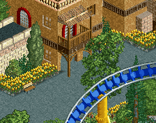
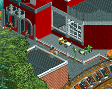
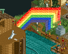
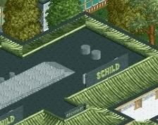
That was the moment of the "what if". So I made a new save, selected the bulldozer and started up flattening things, including stuff I did like a lot (but again in parts). What you see now is the end result of that... and it was very liberating doing it, because why do I keep trying (and in cases failing) to get things to blend together that don't want to. And the truth is: I know now why the stuff didn't work! That is very powerful information to have and strong point to continue with (and freeing up about 20+ small object slots in the process which can help with new themes) -
 Full-Size
-
 No fans of this screenshot
-
 Tags
Tags

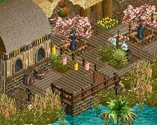
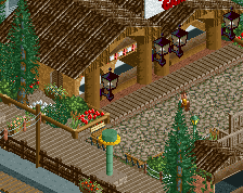
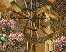
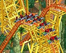
See the LOOONG text to side
Ballsy move, but I recognize the liberating feeling. Is it just that corner you need to finish now? I hope this move as well as OpenRCT will give you the final push with this park.