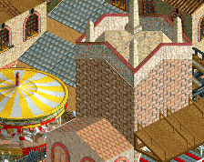
Screenshot / Liberty Bell Carousel
-
 03-March 14
- Views 2,170
- Fans 0
- Comments 8
-
 Description
Another NSCO, no trainers or hacks from me (which just goes to show because it's not too impressive).
Work in progress, obviously, and possible entrance to a Six Flags park (Just mucking about on Six Flags Magic Mountain scenario really and got the itch to build something).
PS. Pay no attention to the paving. That's all placeholder. -
 Full-Size
-
 No fans of this screenshot
-
 Tags
Tags
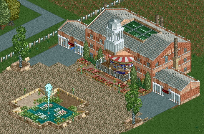
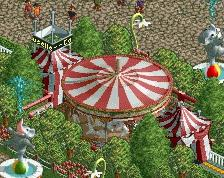

Cool tower! Make the part between the path and the carrousel a bit more lively though. Now it's just sand with some bland flowers.
The tower above the carousel doesn't look very stable to me. You might want to add some support. You also could move the tower back by one tile.
I don't know, it doesn't feel like a park entrance to me. The overuse of bricks and quite bland colours doesn't make it feel very appealing and exciting.
I really like that. The bell tower is impressive and the textures used are very subtle and not in your face.
Nice work.
I often feel that non-trainer ncso has a certain subtle touch that I really appreciate. Well done.
It looks kinda nice, but something about it makes me think that it looks abandoned. Peeps would definitely help that, but I think there needs to be something else to bring a bit more life into it.
cool idea with the tower over the carousel , but I agree with all : the tower doesn`t look really stable
I give you props for doind NCSO without trainers. Once I discovered 8-cars, I was almost 100% reliant on trainers regardless. Looks good, but the colors look a little...meh. I honestly think that just by adding color to the gardens around the carousel will make everything pop and look more inviting!