Screenshot / Cedar Creek Park - Medieval area
-
 04-August 20
-
 Cedar Creek Park - NCSO Realism
-

 11 of 11
- Views 2,011
- Fans 0
- Comments 7
-
 Description
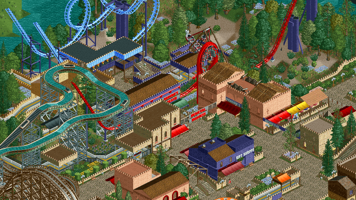
This is the last screen I'll post here for awhile, before the "I submitted the park" overview.
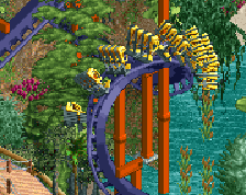
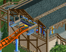
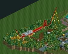
This shows the Medieval area, with the Schwarzkopf flywheel launch, Dragon's Breath, and the Vekoma inverted boomerang, Antiquity, added as the last coaster in 2011. DB was added in 1978. -
 Full-Size
-
 No fans of this screenshot
-
 Tags
Tags

Cool interaction. It's just a shame that you made (all the cool elements of) the coasters invisible for peeps.
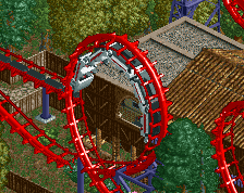
I like the forms here and the interaction between the buildings and tracked rides are great. I echo Faas that the layout of the rides relative to the paths really blocks a lot of views for peeps. I'd also add, the closeness of the red looper, the flume, and the inverted shuttle feels a bit forced. They're interaction is minimal, so instead they are just all kind pushed into the same area, which most parks would try to spread out unless absolutely necessary. Maybe rearranging a few elements would help?
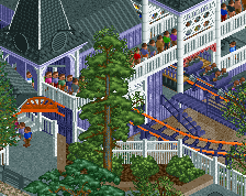
I really like the density of the rides, but I agree you could open the space up a bit to make some sight lines. Also a stylistic tip - if you're using the castle wall as a trim on your buildings, I would use something different around the paths.
I think deleting all the buildings in the middle will get you the desired look.
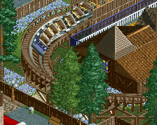
The medieval plaza is quite nice, but the placement of the looping coaster does detract from the area unfortunately. The log flume is nice and I like the queue elements down there.
Very good, I liked the colors