Screenshot / Cedar Creek Park - Ursid
-
 30-July 20
-
 Cedar Creek Park - NCSO Realism
-

 9 of 11
- Views 1,717
- Fans 0
- Comments 3
-
 Description
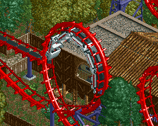
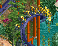
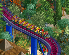
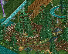
Ursid is the GCI woodie added to Cedar Creek Park in 2009. It was the last custom built coaster to go the park. 2011 was the last roller coaster addition in general, the relocated impulse from the now defunct Lake Azure.
Notes: I tried to give the foliage more breathing room, and I believe I've done a good job of that! -
 Full-Size
-
 No fans of this screenshot
-
 Tags
Tags
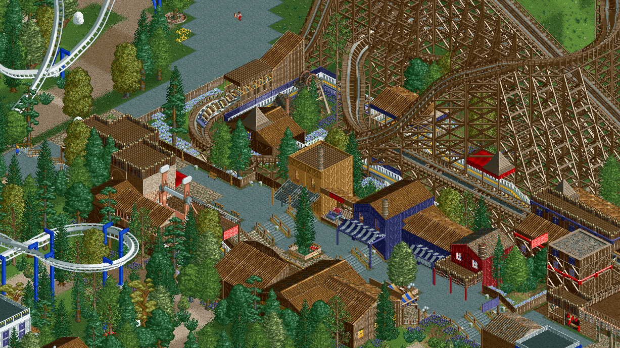
Colors are much nicer in this! Feels a little rigid though in terms of pathing and layout. Maybe look into repositioning that log trimmed building at the intersection a bit so that it opens the area up a little more. Coaster looks sweet!
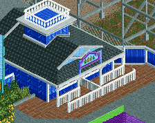
I was also thinking you'd be better of without that log trimmed building. Just take it out entirely. I think it's always a good guideline to have some of the path visible from all angles without interruptions so the path layout is always clear and easy to read. It's what ties your park together! On a more micro scale I still think there's a bit too much fence spam, the red poles and the steel lattice stuff on the station does not contribute anything but noise! Wherever your work is cleanest, it's always best. The middle of this screen is very cozy and well done.
The path could indeed be more organic and opened up. I like the way you've placed the bottom of the drop though.