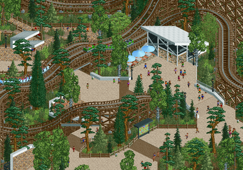
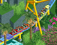
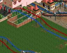
I like this, the white objects really bring out the rest of the colours around them. Not too much going on but I think the non-grid conforming paths really add a lot to this photo.
But, as In:Cities says, I'm not a fan of the Scots pine all being rotated the same way... minor complaint but just rotate one of the three and I think you're all good
Wonderful Liam. So nice to see progress on this. Much appreciate the somewhat sombre naturalistic mood you went for. Very interesting to see this together with the modern architecture style.
The only thing I'm not sure on is the sloped white path. It looks more like a wall? You've likely already tried different things here. I would think it looks better with (more traditional) steps.
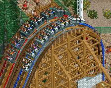
I really like the color contrasts here between the light colored walkway, the dark wood color for the coaster (usually the best choice imo, though RRP did some great things with that light brown color as well) and the palette of greens for the trees and shrubs. For as much as we talk about things like architecture and foliage and ride design, simply picking the right colors is often what makes an image/park pop off the screen. The ride interaction with the environment is very well-done here too.
 07-July 20
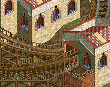
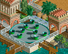
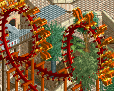
nice try, but I have found several things that Liam™would never approve of here at New Element Designs©®™
4 different paths
5 different fences
tree with the same rotation
are you even really red
Attached Thumbnails
Wow
This might be one of your best screens so far.
Somehow you've pulled off a very vibrant look with only green, brown and white. So that's pretty cool.
I like this, the white objects really bring out the rest of the colours around them. Not too much going on but I think the non-grid conforming paths really add a lot to this photo.
But, as In:Cities says, I'm not a fan of the Scots pine all being rotated the same way... minor complaint but just rotate one of the three and I think you're all good
You always manage to create those parks that feel so real and ooze atmosphere that I wish I was there. A skill I'm very jealous of.
Lol
Yes, the Liam style I love.
Wonderful Liam. So nice to see progress on this. Much appreciate the somewhat sombre naturalistic mood you went for. Very interesting to see this together with the modern architecture style.
The only thing I'm not sure on is the sloped white path. It looks more like a wall? You've likely already tried different things here. I would think it looks better with (more traditional) steps.
I mean, Josh kind of has a point, I think...
Still looking good though!
RaunchyRussell Offline
Damn. You're good.
But honestly the only thing I'd change is the trees
The trees near the top flyover over the path are also rotated the same way, on both sides of the path and on both sides of the track.
Looks cool otherwise.
I really like the color contrasts here between the light colored walkway, the dark wood color for the coaster (usually the best choice imo, though RRP did some great things with that light brown color as well) and the palette of greens for the trees and shrubs. For as much as we talk about things like architecture and foliage and ride design, simply picking the right colors is often what makes an image/park pop off the screen. The ride interaction with the environment is very well-done here too.
this is classy af. closest i've seen to real contemporary design in rct
Nice screen. I like how the coaster interacts with the path. The colors give it some good amount of piece.
Very pretty. I like the weird shrub colour.
cool screen Liam. Love all the sereen colors and that path you used.
Very fresh looking. Great interaction between the coaster and paths, and the architectural style really compliments the whole look of the area.
Really great screen Liam, the composition and colors and sense of calm, classic RCT is really exciting.