Screenshot / Start of CityWalk
-
 05-July 20
-
 Tony's Chocolonely Park
-

 3 of 4
- Views 2,002
- Fans 1
- Comments 10
-
 Description
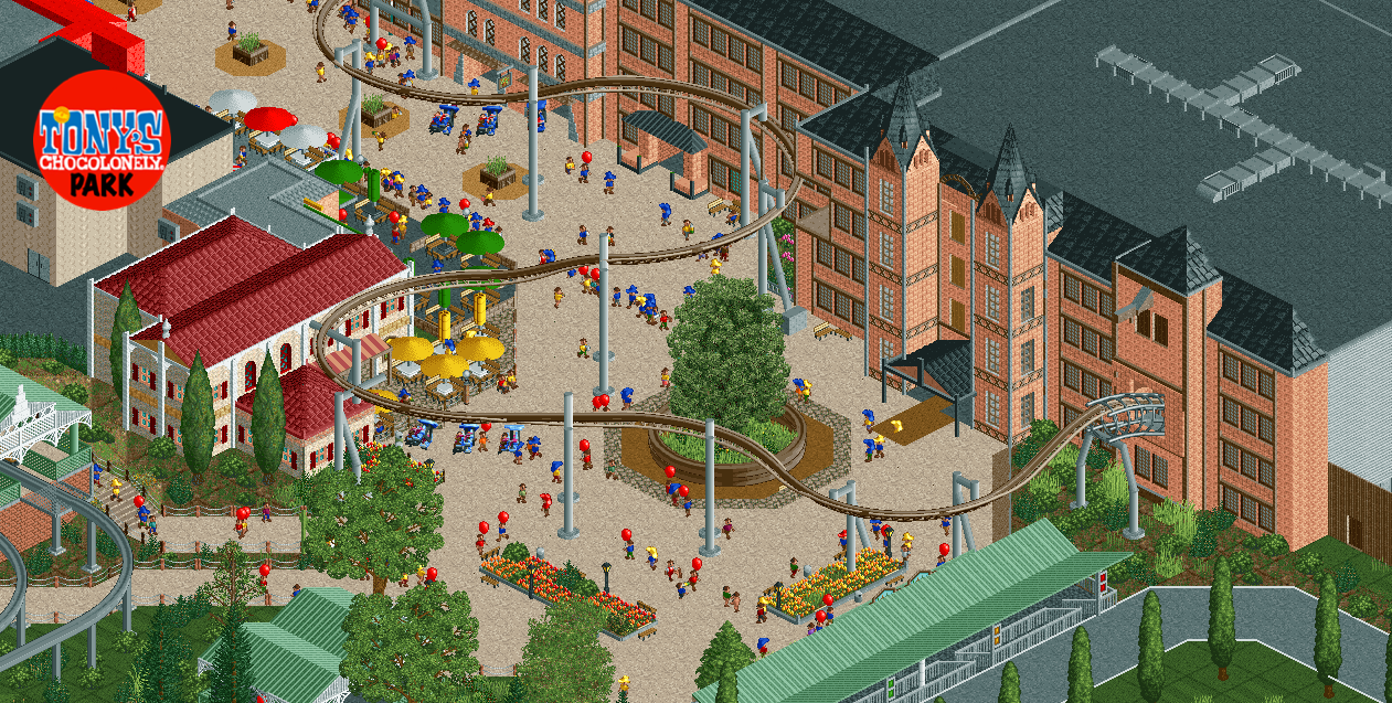
When guests hop off the monorail, the busses or one of the water taxi's, this is where they will start their day: The CityWalk. Main feature here is the Tony Chocolonely Chocolate Factory Tour; the Mack Powered Inverted Coaster with a big dark ride section and a small coaster section over the plaza. Guest can enjoy tapas restaurant 'Het Zusje', Subway, KFC and a few F&B take outs inside the factory.
-
 Full-Size
-
1 fan
 Fans of this screenshot
-
 Tags
Tags
Love the photo almost as much as I love the chocolate. The factory doesn't look anything like a factory here in the UK, much prettier, I paticularly like the use of the half pipe coaster that exits the building.
I'm also a fan of the large open space in front of the factory, I think it suits the style and helps put emphasis on the size of the building.
Perhaps the only criticism is that it seems weird the coaster cuts into the building where you appear to have removed a floor, this does ruin the realistic aspect of the photo perhaps just cutting the building by half a tile would fix this, but this is only a minor critique.
Great stuff.. looks like a fun coaster you got there. If anything I'd say delete the top layer of monorail trim around that tree in the center of the path.
Chocolate is such a great theme! Nice, maybe the buildings could use a bit more detail
Attached Thumbnails
Yow, that coaster is the bomb! that building to, altough those post poles could be a bit shorter at the two towers...
Airtime Offline
I can’t help but think the coaster layout goes against the general areas layout? Like there’s this massive S bend that almost goes the opposite way of the path. I feel it might look better if it was more gentle and flowing with the path.
Agreed on all points mentioned above, with added emphasis on what Airtime mentioned about the path/coaster flow. The track layering is indeed awesome as well.
I love the track layering, and the monorail station exit into the citywalk zone is great. The coaster concept is pretty cool as well and looks great over the plaza.
I would say the chocolate building needs more color, signage, and pizzazz. The entry for the ride should be marked with some color to draw the eye to it and probably feature a logo or sign for the ride / tony brand, which is insanely colorful and energetic. Check out an image search for the wonka factory - every version of the factory gates has a lot of character. The eventual Chocolate Circus factory building is going to have a lot of color too:
https://www.youtube....h?v=vLeMGbAxgEk
Lovely work, great bit of interaction from a peep perspective. I'll echo otter's comment about the planter, it's currently higher than the peeps when they should be able to see over the wall. Perhaps consider putting some nice flowers in there as well, rather than just grass.