Screenshot / The Haunting of Blackford Hill
-
 01-July 20
- Views 1,972
- Fans 0
- Comments 4
-
 Description
From overzealous use of colours and scenery to a more minimalistic design, the gardens of Blackford hill estate lay empty but the inside promises to be a far more engaging affair.
The house sits in the centre of the (as of yet un-named) park. What lurks inside? (Currently a maurer sohne spinning coaster).
Pleased with the architecture on this house, it's a big step up for me so far although I know if I started from scratch again I could do better, hopefully the progress curve remains upward. -
 Full-Size
-
 No fans of this screenshot
-
 Tags
Tags
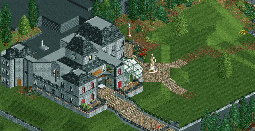
Hey, I really like this! The house got a great shape, and the setting is nicely done. My tip would be to stac consistent with your roof colours, I see some flat roofs in the back are black, while on the mansion they're grey. Also maybe add a few flower beds in the garden? Negative space and breathing room is great, but this is a little too much. To emphasize the spooky team, you could make use of the dead trees.
Great work!
RaunchyRussell Offline
I like the direction this is going! Good building shape and cool little green house you got there.
This is rather nice and the building feels suitably creepy. Perhaps some more garden details like Jappy says, bordering the entry path might work.
I love the vibe here, the mansion is a bit blocky but I don't really mind here. I love how it's very minimalistic yet eerily creepy.