Screenshot / Lake Cryptid - Sasquatch Area 1
-
 28-June 20
-
 Lake Cryptid
-
 1 of 3
- Views 1,565
- Fans 0
- Comments 5
-
 Description
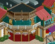
Part of my Lake Cryptid project, the Sasquatch area's main attraction is an Morgan Hyper Coaster. This features the coaster entrance and arcade area.
My first full-scale project working with tricks of the trade such as shoestringing, rides in test mode, and loads of trackitecture. I started this park as part of a contest on the DKMP server and will probably try to expand on the park now that the contest is over. -
 Full-Size
-
 No fans of this screenshot
-
 Tags
Tags
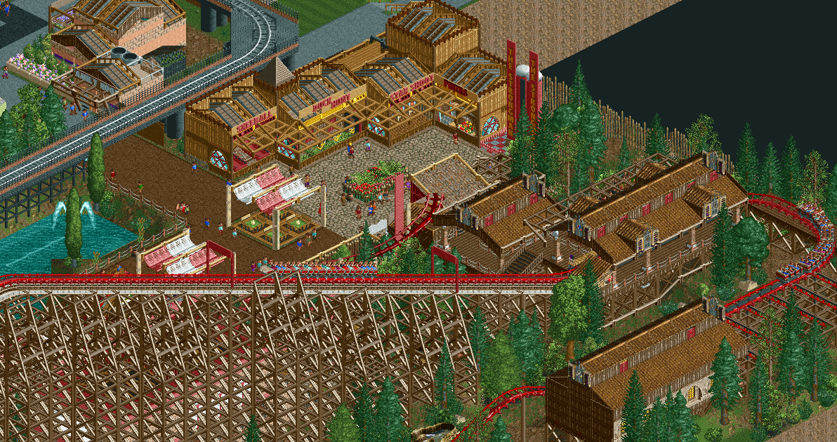
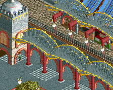

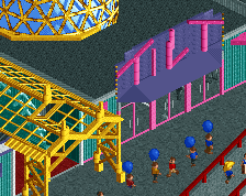
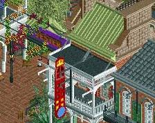
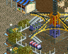
Honestly, the parts with fewer tricks are the best parts in this screen. I feel like you're trying to draw attention to the games stalls and the bobsled awnings and as a result you made them super tall. Also note that the signs on the games stalls are hardly readable for peeps, as the lattice awning is blocking their view. I'd like to see more of the coaster! The colours are nice somehow.
a lot of good stuff here, I would go for less supports and more of a distance between each on the hyper, looks a little overly chunky to me. Also would advise terrain paint under all the paths, since some are and some aren't. Keep it up!
Thanks for the comments - I wasn't expecting any to begin with, and I'm excited that I got a bit of constructive criticism with a bit of appreciation. I will definitely use your comments when continuing with the project!
I like the red colour scheme but I do agree with Liam regarding the games buildings. The coaster station is very nice however.
Liam brought up some good points yeah. Wouldn't it be more logival for the stalls to have the same roof style as the coaster as well?
Apart from that, I really like this! I love the size of that coaster!