Screenshot / Nostalgic return
-
 23-June 20
- Views 1,697
- Fans 0
- Comments 8
-
 Description
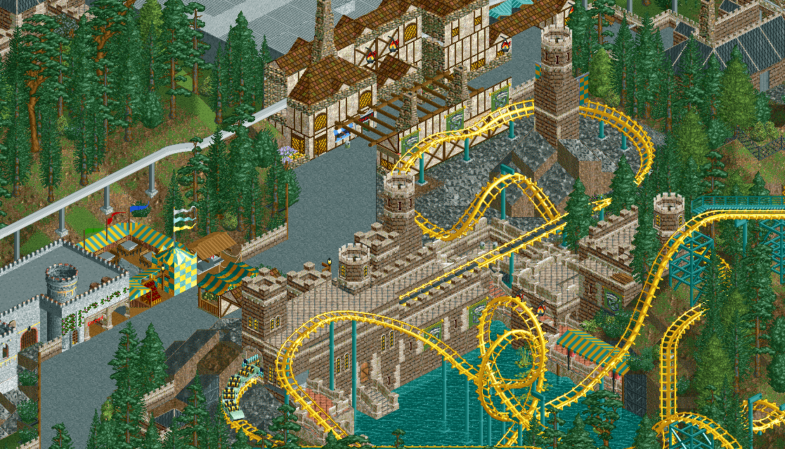
Reinstalled the game with OpenRCT2 for the first time in 8 years, loving the nostalgia and additional time due to Covid-19, so much has changed in-game so thought I'd post a screenshot, although my design style is still living in the past (no mouse = no right click on Mac it seems!)
Learning by doing and enjoying it! -
 Full-Size
-
 No fans of this screenshot
-
 Tags
Tags
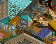
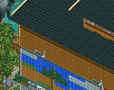
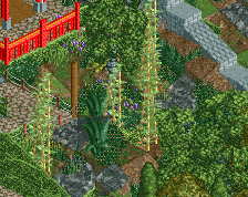
Same criticism as previous screen to a degree: not every building has to be different! Figure out a style that works and use it over a larger area for maximum effect.
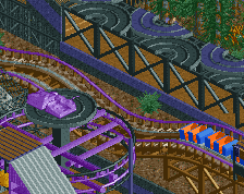
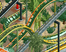
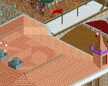
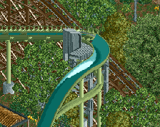
The HP castle scenery look has potential, it contrasts very nicely with the bright yellow arrow coaster, which by the way seems to have a very nice layout! That bit of the screen looks great
Enjoyable to look at. Has promise too. Are you new to NE?
Thanks for the comment on both screens, I agree I suppose being reintroduced to the game and with so much cs available I didn't know where to start or what to do and just wanted to try out everything!
I'm hoping as I flesh out the park the more recent builds will have visible improvements over these shots from around a month ago. I will implement some of your advice and continue to work on the park, I think comparing to my last one from 8 or so years ago is a good yardstick to begin! It's still on NE I believe.
Thanks!
Not new, but posted only a few times nearly a decade ago, haven't had the game since but found more time now and finally have space on my Mac having completed university.
Nice use of the harry potter objects.. they go really well here.
Airtime Offline
The yellow of the coaster really pops nicely. Great work.
I love these objects, the castle was top
Thanks for the kind words, I don't think I'm finished with the area but I've enjoyed building it thus far although I see RCT2 has really moved on in terms of detail these days