Screenshot / Fantasia
-
 01-June 20
- Views 1,968
- Fans 1
- Comments 8
-
 Description
In honor of NE being back online, I decided to use paint in order to hide all the ugly shit in the screen.. Feeling like a real professional now so I hope you guys appreciate my efforts.
Same project as the last screen btw and you may have seen all the finised buildings in this park by now. -
 Full-Size
-
1 fan
 Fans of this screenshot
-
 Tags
Tags
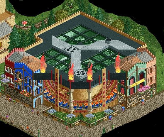
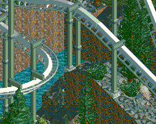
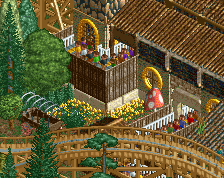
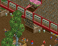
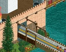
I always like this type of flat and the execution is solid NCSO goodness. I think I see good use of that new(ish) ORCT window customization and I like the use of that rock wall on the structure although it might work better at about half the height.
Agree with Milo.. I'd sink the rockwall 2 ticks. The custom flat otherwise is really nice
Busier than your usaul work! I like it a lot.
Nice to see you active MCI. This is quite charming.
Really nice forms, but I think the colours are conflicting a bit. Not the amount, I think that's fine, but there seems to be a mix of pastels, bolds and brights, and I'm not sure they mesh together. The train and fire suggest something punchy, while the tans and greens suggest more organic. Good work nonetheless, and I like the glimpse of the queuing peeps.
This is really cool, I didn't even notice the peeps queueing below at first. The colours either side are a tad chaotic but the ride structure is great.
Very nice, I like it when there is fire in some way