Screenshot / The Boardwalk
-
 01-June 20
-
 Riverview Amusement Park
-

 3 of 3
- Views 2,259
- Fans 3
- Comments 10
-
 Description
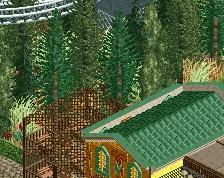
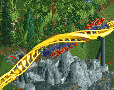
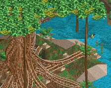
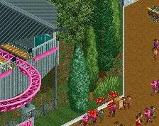
Very much a work-in-progress here, but I had to do a little something for the site's big comeback. Some things are placeholders (like the ferris wheel) or unfinished bits but I am otherwise open to any suggestions. Glad to be back with y'all.
-
 Full-Size
-
3 fans
 Fans of this screenshot
-
 Tags
Tags
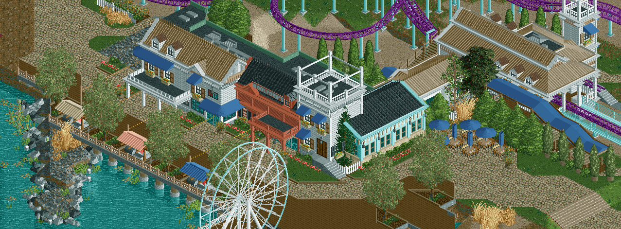
I really like where this is going! great architecture for now. Not a fan of those big supports in the water under that walkway though.
when's your next screen up?
I admire your bravery posting this in public.
I have trouble suggesting things for work in progress previews, but I think you’re on the right track here. Ferris wheel will be a sound addition.
Very tasteful. The boardwalk is fantastic.
I think your detail work on the archy is amazing, that blue building is fantastic. I don't like the boardwalk supports either, the screen is so warm and charming but those are so cold and industrial. Maybe some custom wooden lattice supports might look better?
It's nice, but it's also the most drab boardwalk after Renaview's
So nice, but I think just a few touches of brighter colours would go a long way. Small things like changing the window box plants from tan to yellow.
Nice work, and very quaint and beautiful, but for me the buildings lack purpose. They look like plain houses while I was expecting arcades, shops, restaurants....
The texture of the blue canvas blows but the use of it is intricate and skillful enough to pull it off. The rest is classy, as always.