Screenshot / Universal Studios Seoul - Ghostbusters, KONG, and NYC
-
 04-May 20
- Views 4,200
- Fans 12
- Comments 30
-
 Description
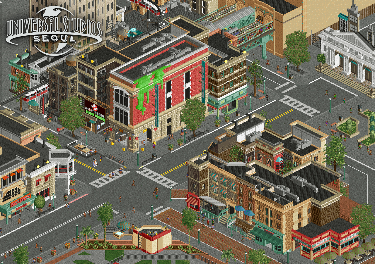
Welcome to Universal Studios Seoul!
Featuring:
- Ghostbusters: Slime Strike (Queue Entrance)
- New York City Tram Tour: KONGfrontation
Figured I might as well show this properly now, since I've been streaming it on discord lately. Still slightly unfinished on the right side of the screen.
Aiming for a nostalgic Universal park feel, while also featuring some new rides and attractions.
Josh -
 Full-Size
-
12 fans
 Fans of this screenshot
-
 Tags
Tags




Love the slime. Love the palette. The Kong ride is something I'm looking forward to seeing more of.
so so excellent
Awesome screen. Great archy, that back alley is such a cool entry for the queue.
Amazing screen man. I like that you've stuck with mostly shades of brown for the buildings and reserved brighter colours for the details.
Good work, but I don't like the palette. The worn-out colours make it look like a theme park set in a post-apocalyptic world.
Setting new standards for American detailing here!
This is 10 steps forward from your last stuff. Amazing.
Wow... Just wow!
Outstanding work Josh!
Amazing, amazing, amazing screen. You've mastered using just the right amount of objects on each building. There is no over-detailing/object spamming at all, so well balanced. Looks totally legit!
How do you make that jaw-dropping emoji on NE posts?
Very cool. Just so good to see on what a roll you are right now.
This is incredible work In:Cities. I love the archy and the idea of the entrance starting in the back-alley. Was already drooling over it when you showed it on Discord.
Only thing I don't understand are what the black-yellow things on the top of the buildings are supposed to represent. Are they lights? If so, I think you could use some other items to represent them better. They look very underdetailed compared to the rest of the screen.
Im a fan, unreal quality here
one question. Do other universal parks in foreign countries use English on their signs or is it a combination of both? if so I think you should try and incorporate a form of Korean in the signs, kind of like robbie did for tubiao.
Stunning level of detail, and such a great atmosphere oozing from the screen.