Screenshot / Tea and Jelly
-
 02-May 20
-
 Otterdale Gardens @ Lockdown Lake
-
 1 of 7
- Views 1,361
- Fans 0
- Comments 7
-
 Description
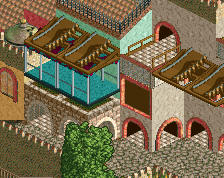
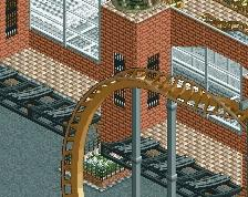
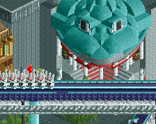
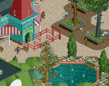
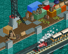
A shot downhill from the entrance area. I made a teacup ride with a clever name and tried to set this mini coaster nicely into the hill. I've been incorporating (or at least trying to) some of the guidance on foliage from In:Cities. So if it looks bad it's all his fault. :D
-
 Full-Size
-
 No fans of this screenshot
-
 Tags
Tags
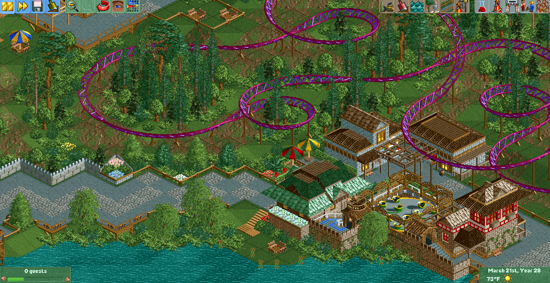
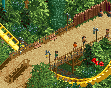
Really pleasant atmosphere here! Good composition, and the retro object selection gives a special charm.
Agree with mintliqueur.. very pleasant. Interesting tree combos, but I like it.
This looks fantastic! Feels very old school RCT-Guide! I'd love to see more of this.
One tip, add the light brown sand udner your paths. It'll make it look a lot beter. Trust me
I really like this. The coaster flows nicely with the slight variations of the landscape, and I think the colour choices are good too. Unsure what the theme is, but it seems to be working nonetheless.
Not a huge fan of the path. I really like the colors and foliage work tho. Interested to see more!
hit the nail on the head
Consider it done.
I absolutely love how everyone's commenting on it looking retro. Just so we're clear that's not some kind of intentional throwback or flair. I'm literally just using an old NE Pro Tour bench and building the last way I remember how to. Which was back in 2010...? I think? Kumba had just released Kumba. That's the last thing I remember. Oh yeah, and that fiasco with K0NG had just gone down. That's the era I'm coming from. If you will...
XD
Thanks so much for the feedback guys! Very helpful to know I'm heading in the right direction. More to come soon.