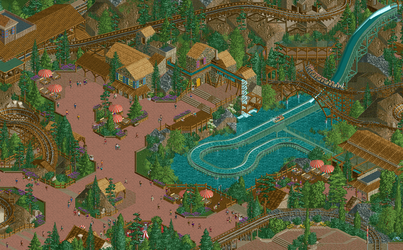
That interactive moment between the flume and mine train is fantastic. The entrance to the log flume is grate as well, and the who ambiance of the area is god-tier.
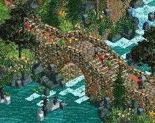
Is it meant to be Disney? Because it doesn't feel very Disney.
It looks great if you're not going for Disney though. The red path is an interesting choice that I'm not 100% sold on, but it definitely adds a unique feel. Your composition for queue entrances is always spot on.
Wondering if the splash is long enough? This was a mini concern I had with AW that boats would sometimes hit the curves a tad too soon. Then again I suppose they don't slow down fully in real life either.
I actually think the grey feels much more theme park-y. The red makes it feel more like a...darker/twisted theme? A Grimms Tale rather than a Fairy Tale in a way.
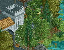
The composition and atmosphere is on point, however i am missing some of the detail and nuance you did put into the entrance of the park, hope to see that in other places aswell eventually!
I actually like your alternate path color more^^^ haha. Gives it more atmosphere and feels "darker" to me. Guess i'm the opposite of Trav with that lol.
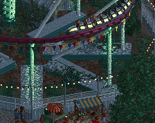
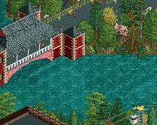
Either way, that bank over the drop is phenomenal. So well done.
Although if this is meant to be Disney, it doesn't give off that vibe just yet. Personally I'd like to see you just do your own thing and not try to conform it to a park chain, as much as I am guilty of doing that myself.
The new path is way better in my opinion. Looks great I love the atmosphere here. Thatch roof building with the blue shutters is money.
I think the thicc poles bordering the path look kind of weird, but thats just a preference thing. I think the thicker poles work when they border a planter, but when its just path edge I think the deco blocks work better there.
Very surprised some like the second path more? I think the original is clearly better as it has an artistic element that would be lost otherwise. You decide alex.
The red is better than the grey/brown, but I think the issue is the texture honestly. Its super saturated with this palette and sort of gives off a weird look. Perhaps there's other colorable paths you can experiment with?
Obviously this is compositionally and aesthetically masterful, but there’s some small things that could be improved for me to truly push it over the edge.
You kind of shot yourself in the foot using the rock wall as much as you did, because now every path texture might make it feel too busy. The red path is nice, but a brick or crazy path thrown in the mix couldn’t hurt. Russ is right about the texture of it — it just doesn’t have much depth.
If the colors have a purpose then fair enough, but there’s so many colors on the shutters and the rides and umbrellas that it just doesn’t feel cohesive. Even if it is cause of the theme, I would bring it all together with a true color scheme for the area.
Some of the building forms are little weird for me. Behind the 2x3 in the center is really messy with a 1x1 tower and 2x1 section with a roof going in another direction. It could just be cleaned up I think.
Is it meant to be Disney? Because it doesn't feel very Disney.
It looks great if you're not going for Disney though. The red path is an interesting choice that I'm not 100% sold on, but it definitely adds a unique feel. Your composition for queue entrances is always spot on.
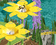
Agreed wholeheartedly. I think the purple flowers are killing this - the path shouldn't be sucking in my attention as the brightest thing in the screen. Try a yellow or baby blue or something in the flowers to help reverse the field/ground effect here and make the park bits the focus instead of the path bits.
 30-April 20
Holy fuck balls.
That interactive moment between the flume and mine train is fantastic. The entrance to the log flume is grate as well, and the who ambiance of the area is god-tier.
Damn.
Is it meant to be Disney? Because it doesn't feel very Disney.
It looks great if you're not going for Disney though. The red path is an interesting choice that I'm not 100% sold on, but it definitely adds a unique feel. Your composition for queue entrances is always spot on.
you win RCT
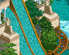
I love that coaster bridge above the flume and the queue going in and out of the cliff.
Very nice though, interaction and planning of the area is great. Also love the little extra ride details.
thanks all!
@Trav - only the ride/theme idea
@G - i'm open to suggestions w the path - i tried a warm grey in the same texture, which also works I think but maybe some atmosphere is lost:
Amazing atmosphere. The purple flowers are a great compliment with the browns/reds
I actually think the grey feels much more theme park-y. The red makes it feel more like a...darker/twisted theme? A Grimms Tale rather than a Fairy Tale in a way.
The composition and atmosphere is on point, however i am missing some of the detail and nuance you did put into the entrance of the park, hope to see that in other places aswell eventually!
Alex,
I actually like your alternate path color more^^^ haha. Gives it more atmosphere and feels "darker" to me. Guess i'm the opposite of Trav with that lol.
Either way, that bank over the drop is phenomenal. So well done.
Although if this is meant to be Disney, it doesn't give off that vibe just yet. Personally I'd like to see you just do your own thing and not try to conform it to a park chain, as much as I am guilty of doing that myself.
The new path is way better in my opinion. Looks great I love the atmosphere here. Thatch roof building with the blue shutters is money.
I think the thicc poles bordering the path look kind of weird, but thats just a preference thing. I think the thicker poles work when they border a planter, but when its just path edge I think the deco blocks work better there.
Very surprised some like the second path more? I think the original is clearly better as it has an artistic element that would be lost otherwise. You decide alex.
ejvhkstlrtn'ylzrmkfgt;l
The red is better than the grey/brown, but I think the issue is the texture honestly. Its super saturated with this palette and sort of gives off a weird look. Perhaps there's other colorable paths you can experiment with?
Red path for sure.
You kind of shot yourself in the foot using the rock wall as much as you did, because now every path texture might make it feel too busy. The red path is nice, but a brick or crazy path thrown in the mix couldn’t hurt. Russ is right about the texture of it — it just doesn’t have much depth.
If the colors have a purpose then fair enough, but there’s so many colors on the shutters and the rides and umbrellas that it just doesn’t feel cohesive. Even if it is cause of the theme, I would bring it all together with a true color scheme for the area.
Some of the building forms are little weird for me. Behind the 2x3 in the center is really messy with a 1x1 tower and 2x1 section with a roof going in another direction. It could just be cleaned up I think.
Keep it going!
Agreed wholeheartedly. I think the purple flowers are killing this - the path shouldn't be sucking in my attention as the brightest thing in the screen. Try a yellow or baby blue or something in the flowers to help reverse the field/ground effect here and make the park bits the focus instead of the path bits.