Screenshot / Upon Entering Caer Hywel
-
 28-April 20
-
 Caer Hywel
-

 4 of 7
- Views 1,650
- Fans 2
- Comments 9
-
 Description
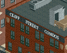
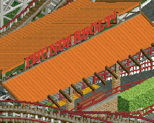
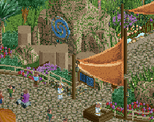
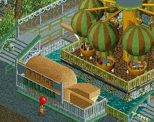
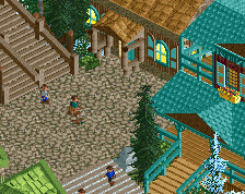
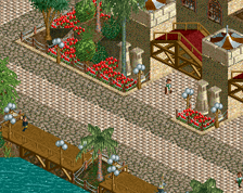
Upon entering Caer Hywel, this area serves as the "main street" of sorts. From this village plaza, guests can go in three different directions into the park. But before you head towards the various castles and fortresses around the park, why not stop for a quick scoop of ice cream in the village, or check out the local stables?
-
 Full-Size
-
2 fans
 Fans of this screenshot
-
 Tags
Tags
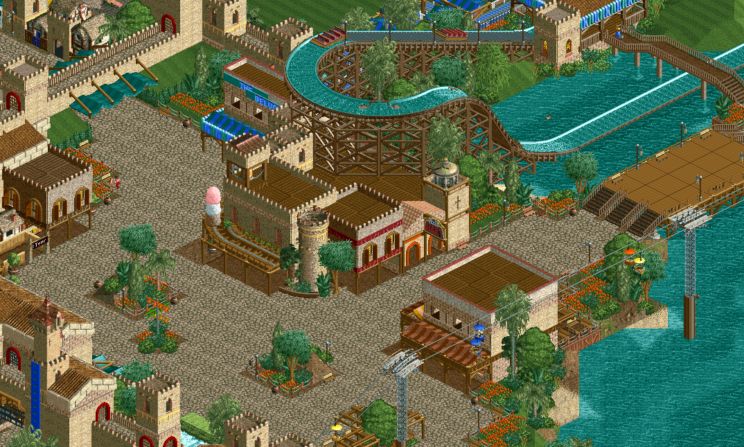
Man, you're on fire with this park. Almost alex quality... Really like the use of the mown grass effect, it helps to add negative space. Only remark is that the square feels a tad empty, but I feel like this is one of those times adding peeps would fix it.
Yeah this is great work otter... you're killing it bro!
Very sweet stuff indeed.
Wish the planter with the directional signs had the same fencing or some consistency with the other two, the sloppiness of the foliage also isn't my favorite. Might not really need to be a planter at all, could work fine just in the path or integrated in another manner.
Sorta feels like you can't decide between organic or geometric path/foliage blending.
Great stuff otherwise, really shows improvement.
Looking great!
Not a huge fan of the path texture on the bridge to the right to be honest. Just looks out of place. I guess the vanilla brown tarmac texture would suit better there, or some of the wood textures used on the roofs combined with invisible path.
LL vibes with the planters and textures. Pretty exciting to see some more.
oh this is sweet. i love those open windows on the right there. I think it needs an injection of color and lushness- maybe its too much crazy paving and not enough green/brown foliage spilling over onto it?
Brilliant work. Thought it was LL at first, that is a major compliment!