Screenshot / Scene from Riverview
-
 27-April 20
- Views 3,291
- Fans 6
- Comments 26
-
 Description
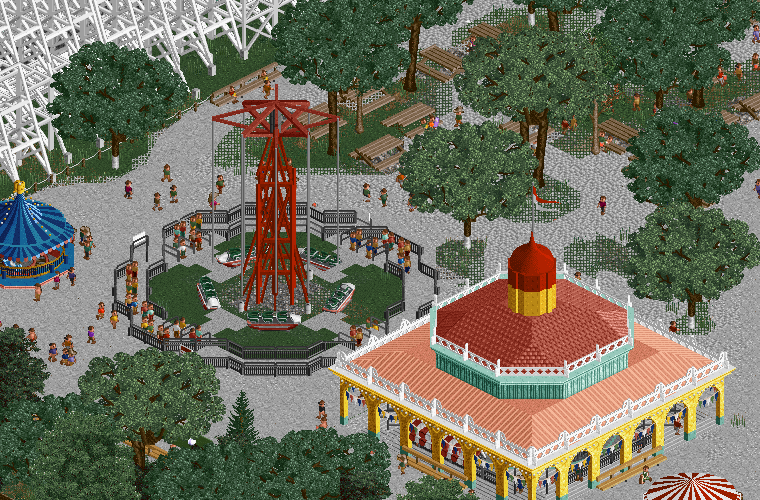
Strat-O-Stat, Carousel, Picnic Groves.
One of the longest lasting attractions at Riverview, the Strat-O-Stat was originally known as the Aero-Stat when it was installed near the main gates in 1904. During a 1908 expansion the ride was moved to the back of the park where it received its new spaceship-themed cars and name.
Built for the same 1908 expansion, Riverview's famous carousel features 70 unique figures hand-carved by Swiss-Italian carvers employed by the Philadelphia Toboggan Company.
One of only two rides to be saved from demolition, the Riverview Carousel was purchased by Six Flags in 1972 and installed in Atlanta, Georgia, where it remains in operation today. -
 Full-Size
-
6 fans
 Fans of this screenshot
-
 Tags
Tags


This is really cool! Stoked to see some new work from you. Absolutely love the flat ride. very cleanly done.
Nice job!
This looks amazing! You've improved it soooo much since starting out a few years ago, hopefully we won't need to wait much longer?
EDIT: I do think the rocket ships ride needs some sort of ride operator booth, or area for the operator to stand. Little details like that will really help flesh out rides like this and make them feel even more real.
wow that palette is nice
Really cool, you are nailing the old theme park vibe here.
This looks stellar. I love the texture work on the path, and that custom flat looks phenomenal.
This is just lovely, great work on the flat. Reminds me of what G Force was doing with Euclid Beach
This is really fresh - I love the look of the trees dotted amongst gravel. I think the trees shouldn't be this dark and dull though, especially when the building is so bright (and this could perhaps be dulled down a tad to balance things out).
Yeah looks like Euclid Beach, but better! Good stuff
The gravel trick is also amazing, I kinda want to find a way to use it for my parks as well hah.
Very unique! Loving the old school feel this had. I agree with alex about the colour of the trees though, they're a tad too dull for me.
Arjan v l
I think he made them way back in 2013, really haven't been used much until recently though.
great work here, the path texture looks really great, and you've definitely continued to improve this project which is great to see.
These trees have been around so long? Wouldn't have thought so at all.
They were pretty tough to use in vanilla due to the ghosting of large scenery objects while zero clearanced.
really love this
Really sweet retro vibe, I love parks of this era.
Interesting effect with the path mesh.