Screenshot / Filling In
-
 02-April 20
- Views 1,512
- Fans 0
- Comments 7
-
 Description
Hey Peeps,
Hope everyone's doing OK? Parks pretty much there, might even finish it tonight.
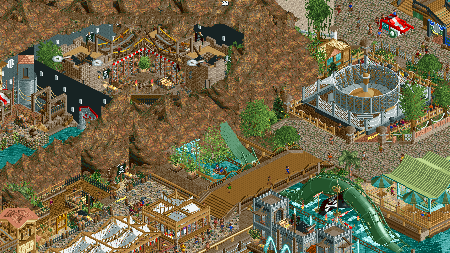
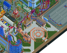
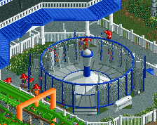
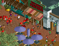
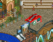
So here's a screen of areas being finished off; including inside Treasure and Monsters indoor section and bridge. You can also see Carribean bar and grill and Rigging Round Up. -
 Full-Size
-
 No fans of this screenshot
-
 Tags
Tags
Man this is just so good. I love seeing your posts! No complaints. Object choice is unconventional, but it works in this setting.
Those are some wild rocks. They definitely don't fit the RCT aesthetic, but I like the rest of the area.
this texture hurts my brain
Your mico is so good here, but its kind of hard to look at. Definitely adjust the rock texture though.
I'm sorry, I don't understand what is what... but there's some great stuff here !
The details are very good