Screenshot / Roscoe's Point: Buena Bay (Mardi Gras Carnivale)
-
 18-March 20
-
Roscoe's Point: Buena Bay
-
2 of 5
- Views 1,902
- Fans 1
- Comments 15
-
Description
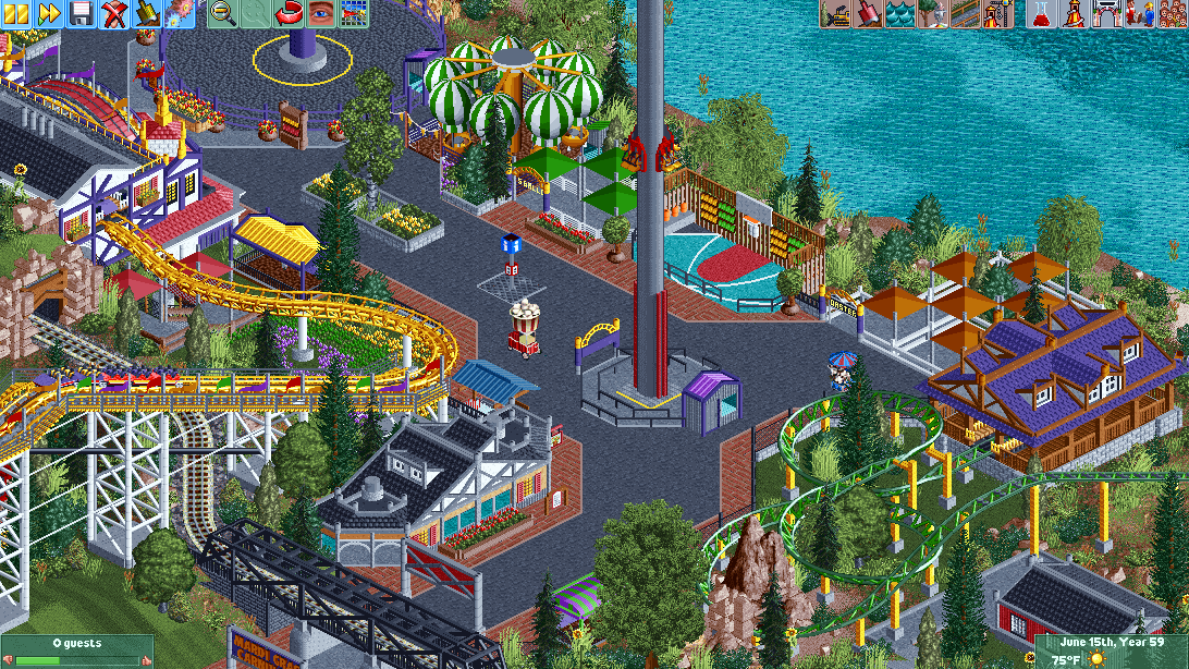
Its been a while, but im back. I've made plenty of progress just taking the time to perfect things along the way, and afterwards. Here is the main entry of the Mardi Gras Carnivale section of the park. Hope you all enjoy and I appreciate any feedback and suggestions!
-
Full-Size
-
1 fan Fans of this screenshot
-
Tags
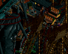
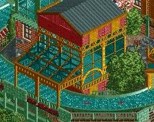
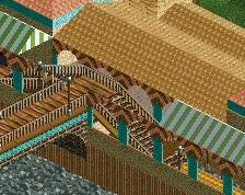
This kind of archy scaling and foliaging really makes the rides seem massive and push through, which I like a lot! The cart stalls add to that. Cute.
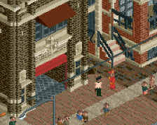
In general this and your other screen appear to be a very good step up from your first screen of the park!
It almost looks like you wanted to hide the lakeside for the guests. Maybe you could make some cool viewing points or something so that it looks a bit more open. Im also not a fan of the awnings above the queue.
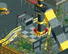
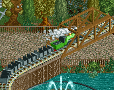
A very nice piece. Railway bridge - solid construction - pleasant for the viewer. Everything very aesthetic "completely new". However, if from the designer's point of view I could suggest something, I would point to moving the lottery with the game of basketball to somewhere else. On this place, he put a tower from the center of the screen, or set the tower on the water, and in the place after the lottery made a queue (i.e. walkways to the tower).
I wonder how people can build so tiny and yet make it look so good... Lovely screen, very atmospheric. I'd raise the roof of the kiddie coaster station by 1 unit. I also echo Mk's comment to make the lake viewable for the guests.
I really like the vibrancy of your screens - really makes them stand out amongst the subdued tones of everyone else's stuff. Loads of cool little sections with plenty of busyness. Nice work.
The foliage here might be a little crazy, personally prefer if its a bit more trim and proper, atleast when it comes to the gardens. Outside of that the archy and design is a bit deco trim heavy, but its very nice still. Just clean it up a bit going forward and you'll be just fine.
Wow. this is so colorful
I like this alot, Not to much for me to offer really. Basketball net could be a little higher. Colours are overall kinda wacky but I think they work for the most part
This is so vibrant, I love the color choices and the overall composition. Some really great work.
Great screen - it's not easy to pull of some of these dark and saturated colours but you did it very well.
I love this. Great bold colors.
I like this, but I don't like the pallette. I can't help but think it would look better without.
This looks really fun and festive, maybe a little cramped, but I think that adds to the style you're going for. Reminds me of the midway sections in Baker Lake!