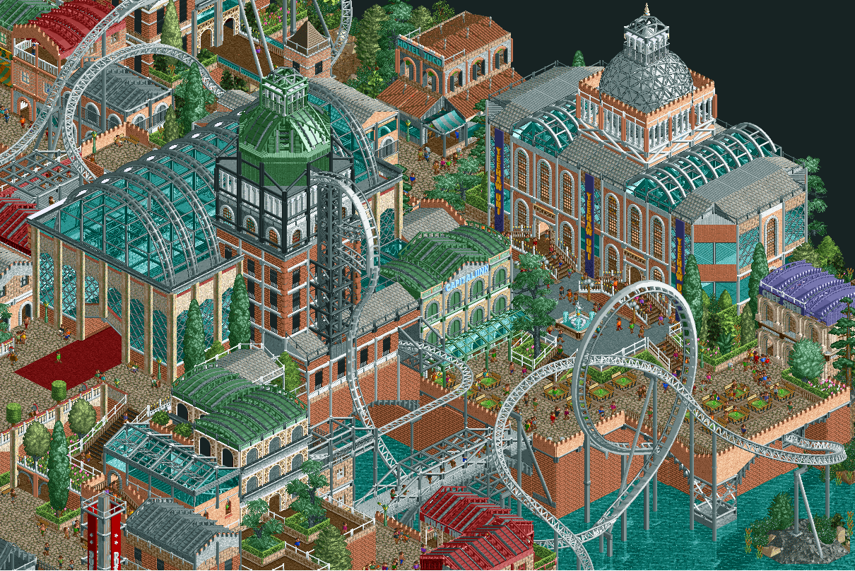
Screenshot / 19th century
-
 06-March 20
- Views 3,471
- Fans 17
- Comments 21
-
 Description
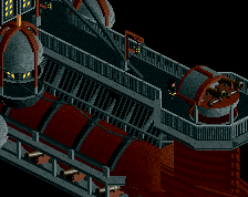
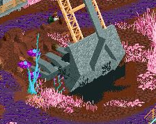
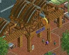
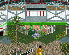
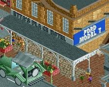
Hey guys. This screen was taken from my latest dkmp contest entry. The project was inspired by 19th century western european architecture, such as the Dutch "paleis voor volksvlijt". I've been toying around with the idea of taking things a bit slower and taking my time to turn this into a full scale park / project without being rushed by a time limit. Curious to hear if this is something people would be interested in seeing.
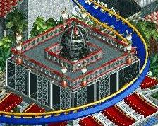
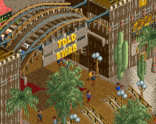
I'm also wondering what your thoughts are on using expansion objects. I tend to avoid using them for the most part, but things like the sandstone pillar or the marble arches as seen on this screen often find their way into my projects.
For the actual screen itself, i would probably redo the coaster, and likely remove the beyond vertical drop. I don't like how it looks in rct2 but it was a requirement in the contest. Anyway, thanks for reading and any feedback is always appreciated. -
 Full-Size
-
17 fans
 Fans of this screenshot
-
 Tags
Tags

Yeah I absolutely love this.
I do wish that this had a bit more breathing room, but it's understandable given the contest rules!
I love looking at this. Object use is absolutely fantastic and the screen is just so cohesive and fun to explore. Really great use of expansion objects, colors are basically perfect. I'm having a hard time trying to come up with any suggestions/constructive criticism. Maybe not my style of coaster design, but even then, it totally fits the atmosphere. Strong 90%, I'm really looking forward to what you build next.