Screenshot / 19th century
-
 06-March 20
- Views 3,475
- Fans 17
- Comments 21
-
 Description
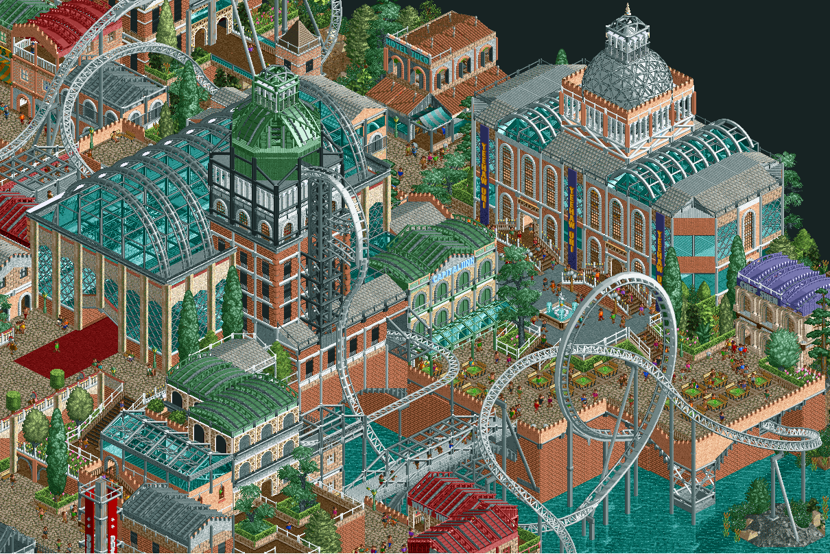
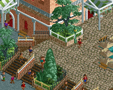
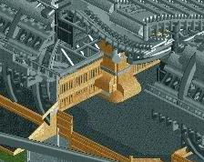
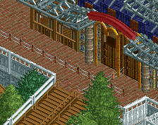
Hey guys. This screen was taken from my latest dkmp contest entry. The project was inspired by 19th century western european architecture, such as the Dutch "paleis voor volksvlijt". I've been toying around with the idea of taking things a bit slower and taking my time to turn this into a full scale park / project without being rushed by a time limit. Curious to hear if this is something people would be interested in seeing.
I'm also wondering what your thoughts are on using expansion objects. I tend to avoid using them for the most part, but things like the sandstone pillar or the marble arches as seen on this screen often find their way into my projects.
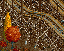
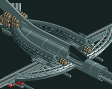
For the actual screen itself, i would probably redo the coaster, and likely remove the beyond vertical drop. I don't like how it looks in rct2 but it was a requirement in the contest. Anyway, thanks for reading and any feedback is always appreciated. -
 Full-Size
-
17 fans
 Fans of this screenshot
-
 Tags
Tags

![screen_136_[Holding] Concrete Jungle #1/3](https://www.nedesigns.com/uploads/screens/136/136_thumb.png)
The bows are great, lots of topics to inspire. Everyone could learn a lot from it.
Damn, this is incredible work!!!!
absolutely great. I love this
Yes please continue this.. amazing stuff.
Looks like the NCSO version of Grand Central.... And I love it. Keep this up, nothing to criticise here. Perhaps a little too much trackitecture?
You're telling me this was rushed?? Dear god, man, this is incredible. I would love to see a full project like this
This is awesome as is, so hear me out:
DON'T go back and fix what ain't broke.
Go for a similar theme with an entirely blank slate. Make it bigger and better than what you've already finished here, which is positively nutworthy, and could probably win you a design accolade from what I see here.
As for expansion objects, there is a slim population here who use them. Those without the expansions installed just don't see anything at all. Personally, I'm more partial to blending LL (using open) with RCT2, but only you have the creative license to make that decision in your own work.
Would be thrilled to contribute a layout from Luketh Layouts LLC to some future work of yours.
~B-]
Lovely
Pretty wild, but also quite cool. You would win an accolade at NE I'm pretty sure.
Thanks for all the kind and motivational words, i guess ill have to give it a go. it will probably take me a few months but i might show some progress screens.
Some of the best NCSO architecture I've seen anywhere, particularly those two large buildings. It's screens like these that make it very difficult for me to avoid opening the game and building NCSO worlds of my own.
I'm usually not a fan of expansion pack objects paired with vanilla objects (especially since I can't open them ingame), but you've worked them in seamlessly here; nothing about them is jarring.
For your upcoming full-scale park, my one suggestion would be to cut down on the use of steel and wooden post fences as building accents. In some places they work; in others they are unnecessary. Often you'll find your buildings will actually pop more without them!
wow very nice good work
That's pretty fucking wild, I love it.
Keep it up, mate!
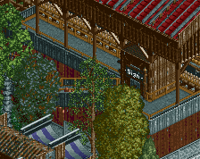
Love that name for the inn!
That's incredible. Love the supports of the drop.
This is gnarly.