Screenshot / tender time
-
 05-March 20
- Views 1,358
- Fans 0
- Comments 4
-
 Description
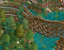
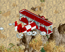
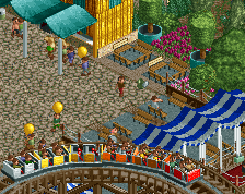
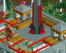
Hi greetings. ... The owner of a large coastal area, on which several entertainment facilities were built, announced a tender for the design of the arrangement of a medium-sized amusement park.
One of the challenges is the renovation of the green villa with a cinema. -
 Full-Size
-
 No fans of this screenshot
-
 Tags
Tags
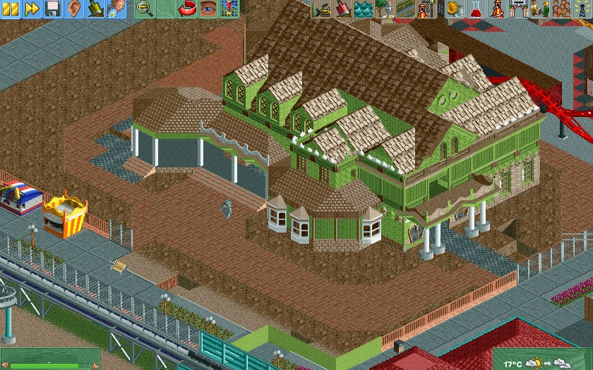
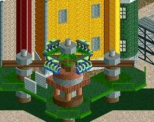
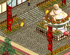
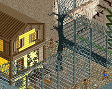
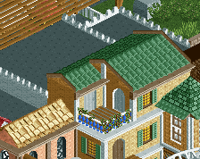
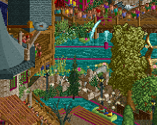
There is a lot here to like, for example the way you did the windows at the bottom right of the building, the sheer size of this monster, and the complex roofing. I feel like if you did some more work on the wall detail and especially the roof detail this building would look really good. As of right now, to me at least, it feels a bit incomplete. Also I am not a fan of the color scheme at all, thats just me though.
In the title you say it needs to be renovated though so idk if you were trying to make it look incomplete and colored weird or what. overall I like the screen, im excited to see more
battle boy this is great! I love the structure of this building. Although I really am looking forward to seeing how you do the landscaping for it. The foliage and flowers will be crucial in making this really stand out!
I think the white accent colour could be worked in a little more, maybe as trim for the windows or something. Either way this looks really good, huge improvement for you.