Eclectic. Just noticed theres a few spots where walls aren't clipping right.. so where you have walls on one tile and the wall above it on the adjacent.
Curious to see how you'll handle the canyons and landscaping.
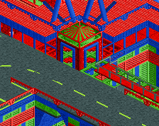
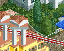
Thanks for the comments! I'm finally starting to move out of this area/color (mostly). Still have to finish the roof and some greenery. Off to the land of yellow and purple next!
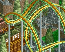
Thanks Luketh, I've toyed with blue paths here, but am debating if that's too much blue overall for the area, especially considering how expansive the roof is and blue as well. Maybe I will take a screen tonight to show both views, no time now before school/work.
Oh and whether dolphins, abstract glass or something else, good call on the upper right stairs, they aren't decorated yet.
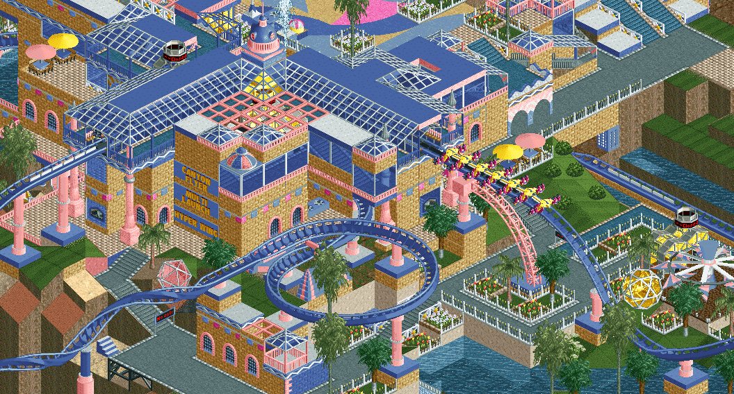
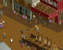
Def looks better with blue. One of my main comments was going to be to consolidate path choices and I think you could replace the remaining grey paths and maybe even the tile ones. Everything else looks great and I think you have a nice thing going with style and object selection. I'd say keep doing what you're doing with an emphasis on readability and composition, hyped to see this finished.
 23-February 20
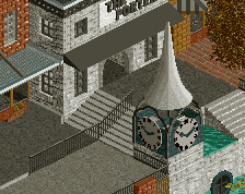
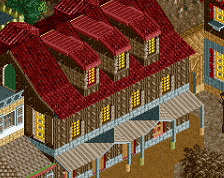
Eclectic. Just noticed theres a few spots where walls aren't clipping right.. so where you have walls on one tile and the wall above it on the adjacent.
Curious to see how you'll handle the canyons and landscaping.
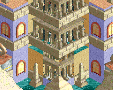
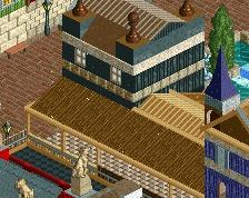
It's weird and colourful..... I like it!
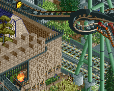
Really like the supports here, quite novel. Also liking the pastel colours.
Thanks for the comments! I'm finally starting to move out of this area/color (mostly). Still have to finish the roof and some greenery. Off to the land of yellow and purple next!
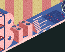
I almost want to see the grey path as blue, I always loved those custom paths with the trimming though.
Cool pastel colors and nice wonky building shape with a lot going on. Those stairs at the top right could use some dolphin statues.
Oh and whether dolphins, abstract glass or something else, good call on the upper right stairs, they aren't decorated yet.
Blue instead of Grey.
Attached Thumbnails
Yeah the blue seems like a good fit IMO
Def looks better with blue. One of my main comments was going to be to consolidate path choices and I think you could replace the remaining grey paths and maybe even the tile ones. Everything else looks great and I think you have a nice thing going with style and object selection. I'd say keep doing what you're doing with an emphasis on readability and composition, hyped to see this finished.