Screenshot / Air
-
 11-February 20
-
 Perenmoes
-

 3 of 16
- Views 4,360
- Fans 7
- Comments 22
-
 Description
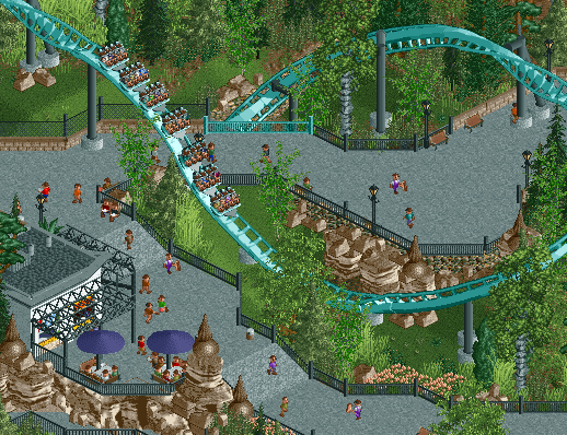
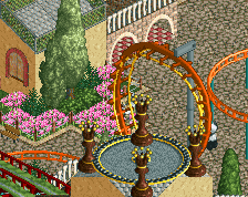
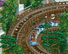
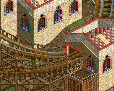
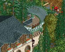
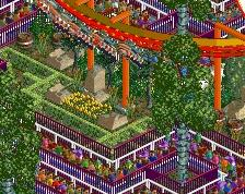
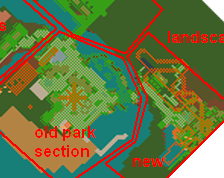
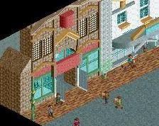
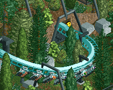
This screen is not supporting my earlier claim that this park is going to be original and rule breaking, as it's another semi-recreation. There probably won't be much more of that, however. It WILL be a unique park despite a semi recreation or two...
-
 Full-Size
-
7 fans
 Fans of this screenshot
-
 Tags
Tags
I see it'll be a race for best flyer of 2020.
Liam making an Air recreation?! Oh dear lord, this gonna be good!
Looks really classy! I think I recognize it from the discord, and as I believe was pointed out there, the very regularly shaped pointy rock formations look quite exotic - but even if they don't feel super-realistic, I do think they look good though from a purely aesthetic point of view. Always like it when there's a bit of experimentation with objects and I think it works here, good call!
I also really like the selection of path objects, they look great together here
Gorg
i love your increasing move towards minimalist design in these parks. very pretty
I'd paint that fence piece black, not sure if that's intentional or not.
Where's the mud?
Looks great dude. Maybe some awnings or nets over the path? Also, it seems that the track is a little low above the path on the right side of the screen.
Fantastic. Love your landscaping and interaction here.
Very natural and calm somehow. Nice.
Ah, the first proper rollercoaster I ever rode. I agree with Cocoa on the minimalism aspect, but that perfectly fits the actual theming which has this bare, large rock, stripped-back feel. Very nicely done.
Regarding fences: I know this challenges my fence policy but there´s a method to it. The rule for the blue fences is that the fences are blue when the track goes underneath - taken from the real Alton Towers area. There are a few more blue fences beyond this screen.
Regarding mud (RCTFAN): I like the grassy look and I thought mud or another texture would take away from the vibrant lush feel of the area, but I quickly tried it last night and I think there´s potential. Good suggestion actually.
Regarding nets: hard no!
Regarding height above path: one of the qualities of Air.
Thanks for the comments, guys.
Does look nice. Love the skin coloured flowers. Can you wrap the fence around them?
It's lacking the trademark Liam sense of fun.
The real pic gave me an idea: I was wondering if you might consider recreating some of the misshaped land looking footers for the ride... like ruins or something directly on the path?
Great screen. Really interesting park with the architecture and coasters shown thus far in the 3 screens.
Very nice and classy. I would do something else with the grey footers on the footpath though. Looks like the actual Air has a more natural looking solution for it.
Not a fan of the spire rocks, but the rest looks great. Although the colours in this screens might be too dark for a theme park setting. I'd change the colours of the umbrellas, bins and the lights of the lamp posts to something lighter to brighten up the area a bit.