Screenshot / Ghostrider 2.0
-
 07-February 20
- Views 2,567
- Fans 0
- Comments 11
-
 Description
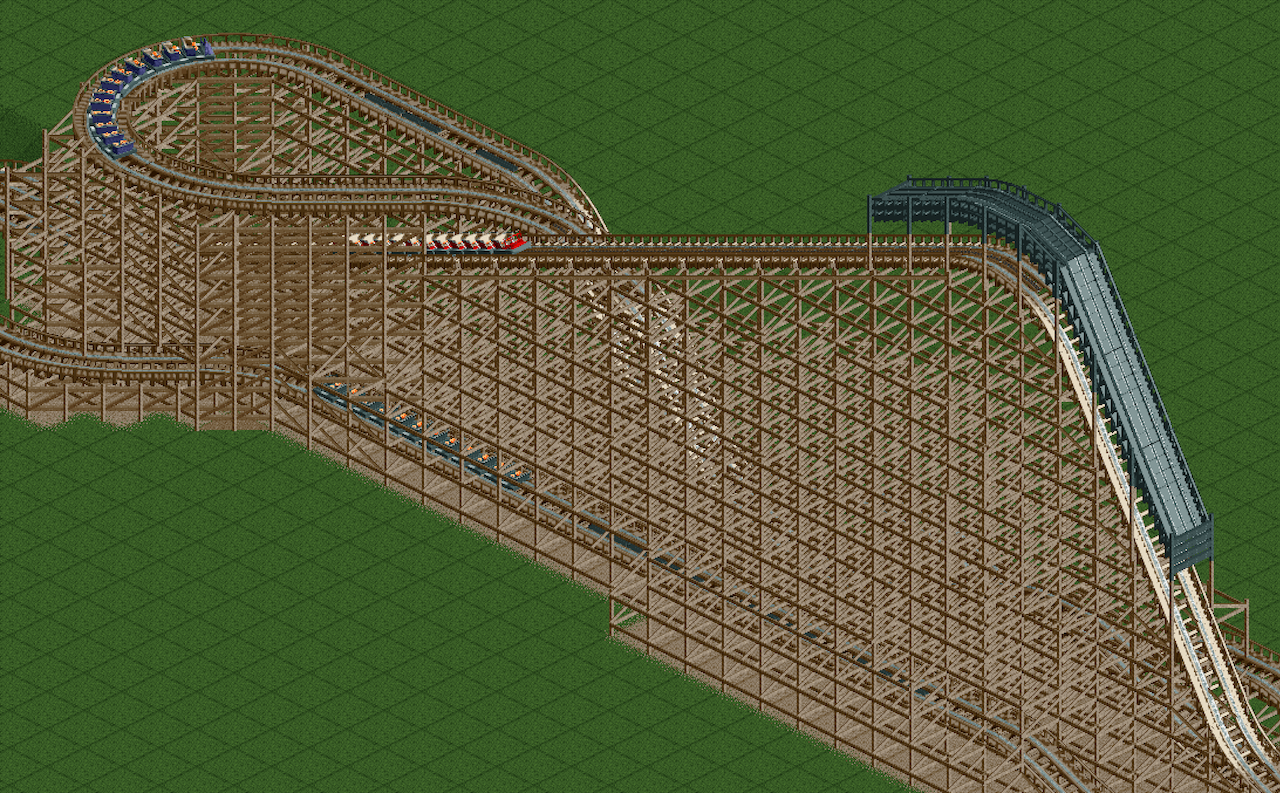
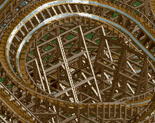
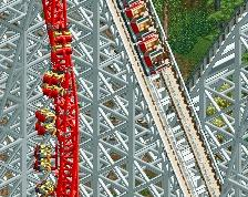
When I don't have the inspiration to work on a project, I come back and support just a little more of this thing. It's tedious, but it's also weirdly calming? I guess that structural engineering degree was a good choice after all!
I know, I know, no surroundings yet. Next time, I promise! Now that I figured out how to get the diagonals supported, I'm taking a break to work on the station area. -
 Full-Size
-
 No fans of this screenshot
-
 Tags
Tags
This looks both impressive and exhausting haha.
Nice work - looking forward to seeing more!
I think its a bit too dense, you could probably reduce the amount of objects by like 30% and it'd look a lot better. Diagonals bits are probably the bigger offender, which is understandable as they're pretty difficult to make look clean in an isometric view.
I'd suggest reducing the density a lot and not having any cross bracing at all, just boxes, and go from there.
i fuck with it
I think this is closer to real life then the in game supports. Looks super cool, I hope you'll have enough slots left to add some surroundings for a design. Needs footers.
I wonder what this would look like in light brown as fresh wood. You could change the colour in the pallet when your done just to see.
jeez thats some chonky supports. can't believe you had the willpower to do that
That being said the comments about density have merit to them. I think Chris Sawyer’s decision to make the bents an X parallel to the track rather than a more “real world” single diagonal brace perpendicular to the track was surprisingly effective. In some ways it just works better in isometric view.
Keep at it though, custom wooden support systems are a rarity in this game (Voyager design and that California Screamin’ rec in an H2H park come to mind). Good luck!
Thanks y'all! As far as the density is concerned, I wanted to really nail Ghostrider's dense support structure as realistically as possible. I know it's a bit much to some, but I studied structural engineering so this has been really fun to create the structure you'd see if you walked through my park. Isometric angles being the only options is tough, but I also try to imagine what it would look like from the ground--then, I think, it would make more sense to everyone.
@Mattk48
Does the color palette changer work on a Mac? All of the guidance I've seen is all for Windows, but I am excited to switch the colors and see how it looks if I can. I also tried just the track being a lighter brown, since that's all that got replaced in Ghostrider's real-life renovation. It's a little weird, but at the same time I kind of like it.
@Sephiroth
The low-density diagonal bracing is potentially in the cards--I haven't tested it out to see how it adds to the structure vs. adds *too much* to the structure, but it's definitely in the back of my head!
Im not 100% sure but I dont think any of the lift supports pass farther than the brake run.
Kudos for the work ethic you put in making those custom supports, that's a lot of hard work. But... I completely agree with Faas. The regular RCT supports just look better.
In general I don't understand why people would want to do custom wooden supports (unless you are doing a hybrid)? It takes so much time to make them and it takes unnecessary object space from the limit...
Nice work