Screenshot / Fireworks Express
-
 04-February 20
-
 Everland Discovery Kingdom
-

 10 of 10
- Views 1,877
- Fans 2
- Comments 18
-
 Description
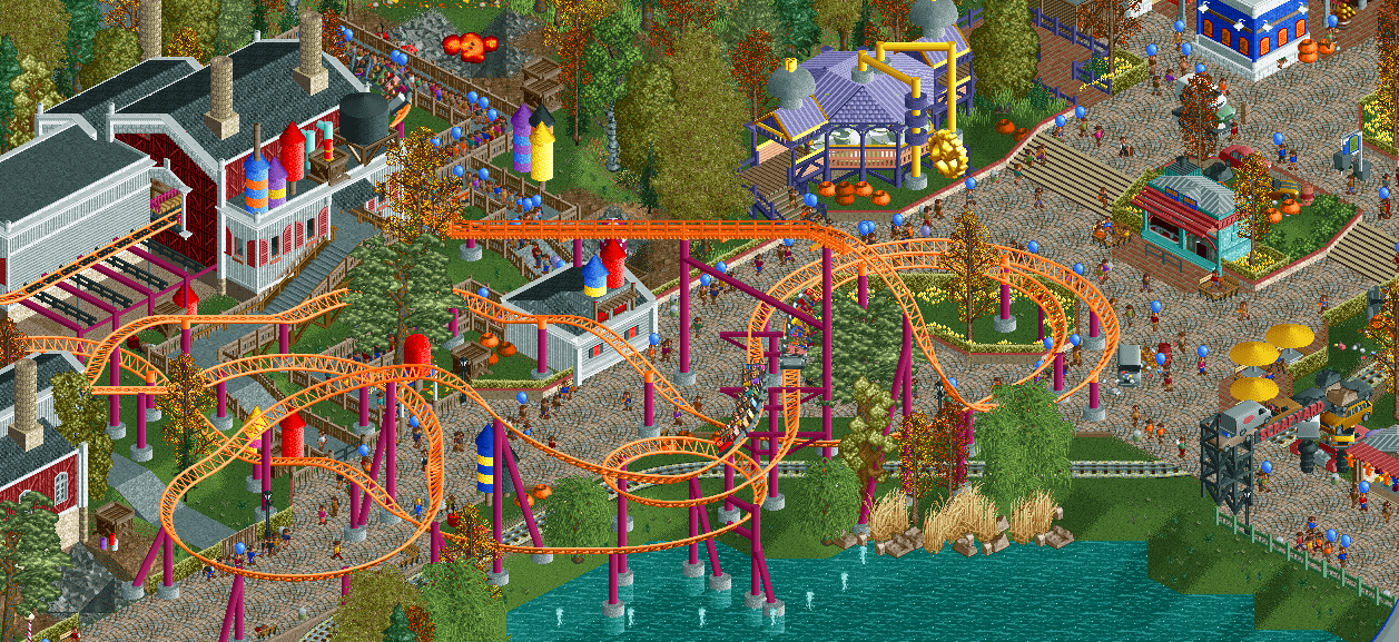
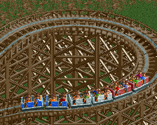
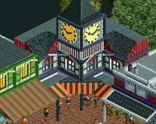
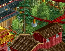
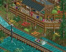
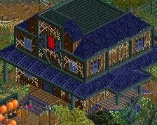
Fireworks Express is one of the rides around The Three Factories area in the back of the park. During the Halloween season, this part is tranformed into the Scrapyard scare zone, complete with outdoor maze, stage show, scare actors. All in a scrapyard Mad Max atmosphere.
-
 Full-Size
-
2 fans
 Fans of this screenshot
-
 Tags
Tags
As a park guest, I think id love walking under this, and how part of it still can see or goes over the water
Shuttered up stalls? Nice little detail. Great stuff as always. I still think though the teacups could use a little more theming. It's such a cool building/structure.. expand it!
Love the fireworks. Really cool theming idea and execution.
I'm not really getting the scrapyard thing though?
This is nice but I wish you'd put some consideration to colour harmony or aesthetics in general. It has everything colour wise, meaning it can't work together, and thus limits its potential for me quite a bit.
Every time you post a screen of this I like the bold move of making the autumn season such a predominant aspect. It's nice how you're realising it. I hope it will pay off in the end. At least it creates a clear face for your park, which is nice, and not to be taken for granted these days.
Compositionally I'm not sure I like the coaster. It feels too draped onto the path/park. The only strong part for me is that little strip of grass and yellow flowers. There the composition makes sense. Everything else is trying to legitimise itself at hand of concrete support fundament objects, which I don't find is very successful.
Sorry if this sounds negative Jappy. I genuinely wish you success with this park. Hope you're content with it.
No scrapyard feeling for me either, but besides that I think this screen really works. Coaster, colours, everything. Colour-wise, it's mainly the coaster that stands out, the rest looks pretty calm and cohesive to my eyes. The brightness of the coaster's colourscheme adds some life and spark to a screen that might otherwise have been a bit too drab. The fireworks theme feels original and is very nicely executed.
Orange is always a great choice for coaster color. And I love the little firework rockets too.
thats looking like some good progress from before. nice life
The colour is high-impact, the level of detail brings enough story and design vocabulary to give a semi-real impression and there is a certain level of charm too. However, a lot of it feels placed instead of embedded. For example, the rocks in the water appear to be floating, all the fireworks are standing vertically, etc. There are so many orange pots that its hard to understand what kind of scrap they're supposed to represent. Is the firework factory supposed to be in a scrapyard?
I'd like to see more variety in the coaster height, especially around the water. It feels like a lot of it exists just above the dwell with little variance below a certain height. I'd like to see this from a few different angles.
Shows a lot of potential. There's something about the composition that really appeals to my eye.
Keep at it.
if the part where the trains are dipped down and traveled UNDER the path, a lot of the problem with the ride "floating" would be immediately remedied. the problem is that the ride isn't interacting with the surroundings, it's just sitting atop it.
I like the concept of the theme and the interaction that I can see between those two trains. Probably a little late at this stage but I agree with Sammy; the ride kinda sits on top of everything. Great for the concept of fireworks, but I'm 50/50 on how well it works as an area.
Generally mixed to positive reactions I see. Not bad at all!
@AVC and @Kaibueno: thanks for the praise guys, always fun to hear!
@Otter: I'm surprised we don't see that more often. I thought it was a neat little idea. I'll see if I can expand the teacups a bit more, you're right that it seems a little barren now.
@Alex: Yeah, shouldn't really have mentioned the scrapyard scare zone as most of it is off-screen to the right.
@Posix: you don't sound negative to me, just like someone with an opinion! And I value yours quite a lot. I'm reading more comments about how the coaster is sort of on top of things instead of actually interacting, and going off that I'm gonna return to the drawing board and see if I can actually make it go under the path instead of over on some parts. That might help reduce the concrete footers and make thing more interesting.
@mintliqueur @csw @Cocoa: good to hear you enjoy it, and that it looks better then last time Cocoa! Mint, like I said to Alex, the scrapyard is more to the right, sort of dumb for me to mention it when all you can see is the gate.
@RCTFAN: the orange pots are not scrap, but pumpkins. It is Halloween after all! Like I said to Posix, I'm gonna see if I can make the coaster dive under the path to give this some more interaction, hope that'll help. I'll also redo the rocks.
@SSSammy: as you might've read in my other responses, I'm gonna do just that!
@CC9:not too late for anything. I want this to be the best it can be, and if people feel that's what needs to happen to improve it, i'll go back and do just that.
Thanks for the replies guys, really appreciate it.
I said it before, place the two 'first drop' turns a bit lower and delete the path there. You don't need it. Make place for a bit theming or green and let the path go around the turns. There's already enough path under the coaster.
cool but extremely messy, tidy up and you've got a winner
Lovely idea for a theme. And while I agree with posix that the coaster is somewhat "draped" over the path, I think it looks good nonetheless. I suppose if you were to edit its layout to include more interaction, it would allow for more theming options (like bursting out of large fireworks/crates etc.), but as said, I like it the way it is, which is just the right side of cartoony.
Such fun colors, even though i'm just looking at a picture I already get such a kinetic feel from this.
I don't want to feel too redundant here, but I too think this spot deserves a bit more breathing room. Even pushing out the edge of the waterline a bit and allowing the initial drop and turnaround to sit within a grassy spot surrounded by path would make things feel much less congested.
Really enjoy this, the fireworks theme is brilliant and it has such a fun energy.