Screenshot / Gondwana - Teaser 2
-
 21-January 20
-
 The Good Earth
-

 10 of 13
- Views 1,427
- Fans 2
- Comments 10
-
 Description
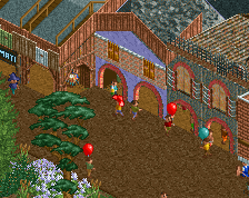
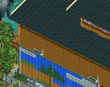
Chaotic markets and buildings crowd the streets of Gondwana, a bustling hive of activity in the heart of Sub-Saharan Africa that could make a mole feel claustrophobic.
This is the second of 5 small "teaser" screens leading up to the release of The Good Earth. Stay tuned for the next, in two weeks' time. -
 Full-Size
-
2 fans
 Fans of this screenshot
-
 Tags
Tags
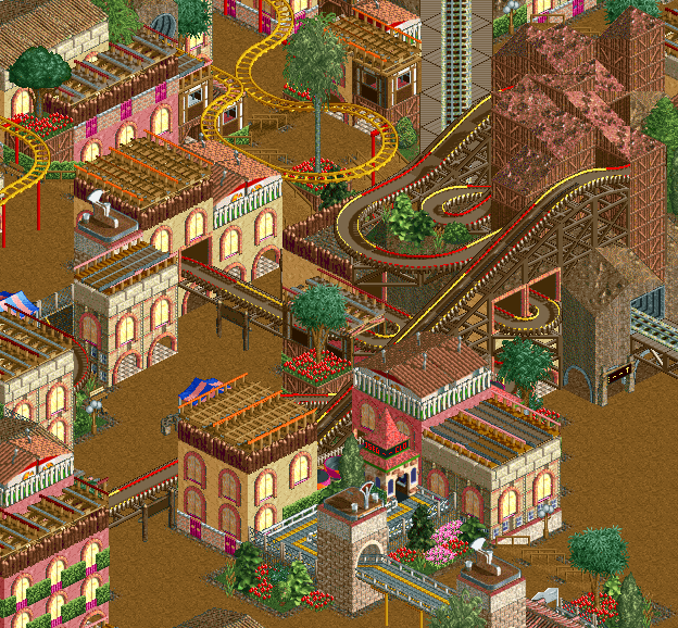
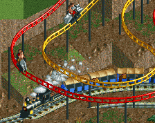
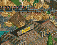
Love the alternating colours on the virginia reel and the buildings remind me (in a good way) of BGSS. Only complaint is the path looks too clean/empty somehow?
This is curvy. Quite likeable. Agree with alex on the alternating colours. Nice touch.
Yooo I love this. It's unique and easy to read. Excellent work.
So superbly sinuous!
The use of the shops and stalls is absolutely spot on, and the colour scheme is very immersive
great atmosphere. I worry that some of your vertical/horizontal lines in this composition "overlap" to create a sort of weird effect where structures sort of blur in an illusion-y way into each other. its not a huge deal and hard to fix here without major work but in general its a good thing to keep in mind going ahead- introducing some assymetry and space between vertical/diagonal elements etc so that its easier to read. I know liampie goes on about this phenomenon occasionally
this whips colors pretty
So glad so see someone using Vifginia Reel as an actual ride and not only as trackitecture. Love the colours in this. Great work!