Screenshot / CC aka too slow for NEDC5
-
 05-December 19
-
 CC full park project
-

 2 of 6
- Views 2,137
- Fans 0
- Comments 12
-
 Description
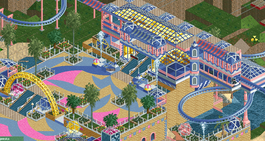
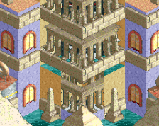
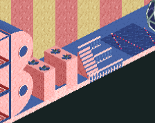
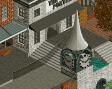
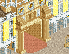
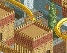
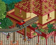
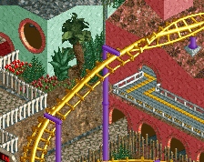
I liked this too much to rush it for NEDC5.
This is the plaza on the other side of the previous screen. Thanks to CP6 for a screen where I first saw the swirly fake path, they are magical to employ.
Oh and not sure about timing or what I do with this, currently has Robbie's suspended. -
 Full-Size
-
 No fans of this screenshot
-
 Tags
Tags
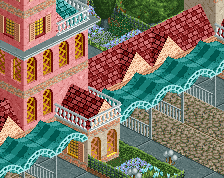
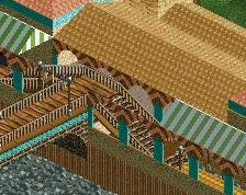
Maaaan I love this. Colors are fantastic.
Whoa shit those paths are amazing. Finish this!
Soooo Bueno
The plaza is brilliant
Nice job with those path objects, really cool to see you continue your style but with a new set of objects. Also love that the square is not symmetrical, difficult idea to pull off but was done well. My one suggestion is to try to break up that big tan wall under the suspended curve a little, maybe raise the water or add some balconies or something.
I'll call myself lucky that I've already seen this before, but it' still fun to see a screen on here nonetheless. Like others said, it's typically your style, but we can see more modern objects and influences creeping though which isn't a bad thing. I'm looking forward to the release!
so excited to see you play with palettes
This is awesome. Would love to see a full park with each area being just a crazy unique colour palette.
I love the colour scheme, but the rest...
I'm sorry, it's just too chaotic for me. Too many embellishments and French curves for the sake of French curves.
I think I'd like this much more if there was an idea of paths and sightlines; that the beautiful uses of different colours are intended to draw guests to certain specific areas, like queue lines or viewing spots.
I think with a little refinement, this could be some wonderfully original work Kudos.
So officially, this is going to be the basis for my next solo full size park, if the 120 to 140 ish map size qualifies. Feel free to confirm that!
Regarding specific comments, I appreciate the support and look forward to expanding the park from where it is now. The colors and pathing have me excited now that it will spread and grow from this core.
Some things will change necessarily, likely including taking the ax to Robbie's suspended. I will do what I can to retain the station though and build a new coaster to fill it.
Thanks again, so happy have a direction to build my first full solo since 2002.