Screenshot / Pegasus Turbo
-
 04-December 19
-
 Antiquita
-

 3 of 8
- Views 991
- Fans 1
- Comments 9
-
 Description
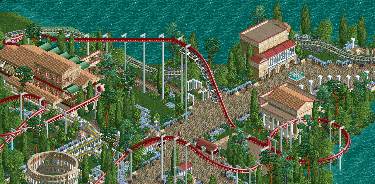
Its not just a Pegasus, but its a Pegasus Turbo!
It's been a real struggle to keep the detailing low and to not go overboard and hyperdetail for the sake of it. I want to maintain simplicity while still being aesthetically pleasing. I hope that is being translated well here. -
 Full-Size
-
1 fan
 Fans of this screenshot
-
 Tags
Tags
This is great dude.
I'd try to focus on the macro aspect with this sort of theme. Don't overdetail like you stated - but maybe make some larger structures that will enhance the theme. Aquaducts, amphitheatres, statues, courtyards, etc.
What a nice take on Robbie's layout, surprised they'd vote an NCSO entry higher than 8.
Aquaducts would definitely be cool^. Maybe some street merchants or something to bring more life to the path?
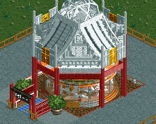
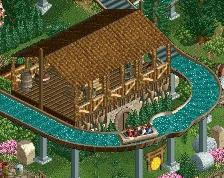
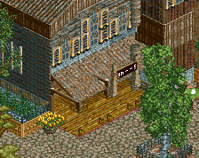
Why no columns on the station?
And the coaster station was a bit inspired by Forum Caleste... where there weren’t columns on every structure. But I might change some detailing to be more obvious in the theming.
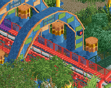
That is some top-quality interaction. The hill swooping over the path is a centerpiece fit for a Roman engineer.
I think you're playing it safer than you need to with the landscaping. Many areas seem as though they're torn between exposing the bare terrain and covering it up. Don't be afraid to let your open grass sing out! The shape of the foliage (including the negative space) is as important as the placement of the buildings, the layout of the path, and the ride elements themselves. If you can tackle the landscaping with the same amount of precision that you already have with those other three aspects (which I know you can because you've done it before in this very park), this area will be spectacular; one of the best in the park even.
You're such a hero to me these days otter. This makes me think how nice it would be if we had a fully supported OpenLL along with some tweaks to faciliate parkmaking...
I'd be careful not to over-water things. I get it plays an important element here, but sometimes it can happen quickly that you raise water excessively and your park content suffers.
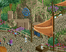
I think everything that's there is nice, and those LL wall textures work magic. Shame these aren't fully supported yet. Perhaps consider some jagged rocks as theming support here and there? The flatness is both nice and a bit too much for me right now. I also feel the buildings on the right would benefit from some windows.
Wish you'd carry the theming into the station a bit more, seems a little bit generic. I like the awnings but the main structure is seemingly out of place texture wise, and with the peaked roofs.
Nice stuff though, looking forward to see where it goes.
Very nice The structures have a real kind of gravitas that Roman buildings should. I particularly like the queue line gallery supported by the Egyptian columns. The foliage is also very well done
  Have you considered putting some small flowers or shrubs inside the Coliseum sculpture, just to make it look a little less artificially placed within the landscape?
Wonderful screen
Really nice and subtle, reminds me of alex's ncso project a bit. Agree on the station, doesn't seem to fit in too well. But the drop and everything to the right is wonderful.