Screenshot / Splash Down
-
 03-December 19
- Views 1,159
- Fans 0
- Comments 5
-
 Description
Hey Peeps
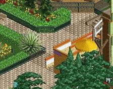
had a tough coupla months but Ive been back on it and got 3 screens coming up
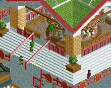
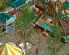
The first is of Pirates of Tripoli's Splashdown. The ride goes round most of the park including a rollercoaster and underground sections.
Also Heave Ho magic carpet and toilets
More Soon -
 Full-Size
-
 No fans of this screenshot
-
 Tags
Tags
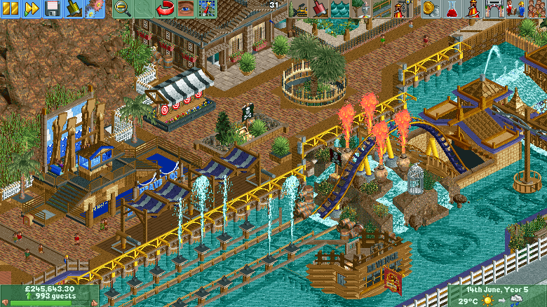
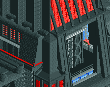
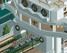
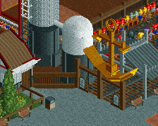
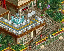
I like where you're going with this, there's just a lot going on in that splashdown. Cutting down on the number of fountains might help on that. Looking forward to more.
I love the atmosphere here, the colors you chose are great. the canopies and custom ride are top notch man (although the super saturated blue on the queue line doesn't do it for me)
Personally I'm not a fan of the flames, I think that would look better as water rather than fire. I also agree with the comments about cutting down the number of fountains
P.S. your missing a custom fence base on the right side of the tunnel building
This is cool! Really liking the tropical pirate-y feel and atmosphere you've got going. Color choices and object choices are tasteful and refined in general, although not sure if I like the object (can't identify it really - is it Liampie's big sunken swamp tree?) you are using on the left side along the sides of the rock wall as wild foliage, it just stands out a little too much against that reddish brown IMO. But the idea to have some foliage there is good, perhaps you can just add some smaller wild foliage like small grasses objects or something around it to make the transition a bit smoother?
And BarnNID is on point regarding the saturated blue and the "flames", those two things together with the background foliage are really the only things I'd tinker around a bit more with. The screen does also suffer a bit from "linearity" in that the different elements and colors stretch out in rows, but I trust that has to do with how you cropped the screen and that it doesn't just go on like that throughout the whole park. Good job, want to see the rest!
The cool rock texture thing looks great - especially when framed by foliage. However, it blends a bit too much with the brick path. I'd look into some different options for pathing if at all possible.
Love it!
This is nice stuff, the colours are warm and it screams your style. I agree that there's maybe too much going on with the splash element, it's a bit hard to read now. I'm also not a big fan of that rock texture to the left, it doesn't really fit the aesthetic of the game but that's just my opinion.