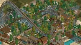
i'm not feeling a particularly strong aztec vibe but I like that swooping turn and queue interaction.
I think its the wooden/rusting roof combo that makes it seem less aztec? I associate that with more very old stone structures, and possibly new archeological excavation structures alongside it. Or, if your theme is meant to be at the height of the real civilization, you would a few grand/central stone structures and buildings and then a sort of lively, vivid marketplace shantytown all around that
I’m with cocoa. Definitely getting more of a dark forest kind of vibe with this screen. Tree combination doesn’t feel particularly jungle-y and I don’t think that’s helping either.
Don't really feel the aztec, mayan or arabic vibes in this particular screen. The layout looks good but the colours are rather dull, and the foliage as well as the architecture seems slightly confused... What theme are you actually going for here?
Imo the aztec theming would work better if you cut down on the amount of wood you use and use more flat roofs and egyptian pieces. I think a lot of multicolored accents on tan/grey walls and blocks along with some pirate roofs and wood accents here and there would work a lot better. You could always just throw in a stepped pyramid somewhere too, maybe a bit heavy handed but certainly gets the theme across, haha.
I'm also not feeling the Aztec vibe, but others have adressed that better then me already. I love the supports on that wooden coaster, very bold choice!.
i'm not feeling a particularly strong aztec vibe but I like that swooping turn and queue interaction.
I think its the wooden/rusting roof combo that makes it seem less aztec? I associate that with more very old stone structures, and possibly new archeological excavation structures alongside it. Or, if your theme is meant to be at the height of the real civilization, you would a few grand/central stone structures and buildings and then a sort of lively, vivid marketplace shantytown all around that
you gotta finish your screens man. or at least crop them so there aren't big blank spaces around the edges.
Coaster looks good so far.
Blast. There are other parts in this map (not regarding the woodie) that are Aztec vibes. Seems I have some work to do in that aspect.
You say dark forest vibes? I could do something with that....hmm
Promising stuff. Look forward to seeing more.
Don't really feel the aztec, mayan or arabic vibes in this particular screen. The layout looks good but the colours are rather dull, and the foliage as well as the architecture seems slightly confused... What theme are you actually going for here?
Hopefully, this helps. More Aztek theme!
Imo the aztec theming would work better if you cut down on the amount of wood you use and use more flat roofs and egyptian pieces. I think a lot of multicolored accents on tan/grey walls and blocks along with some pirate roofs and wood accents here and there would work a lot better. You could always just throw in a stepped pyramid somewhere too, maybe a bit heavy handed but certainly gets the theme across, haha.
Coaster looks rad too
I'm also not feeling the Aztec vibe, but others have adressed that better then me already. I love the supports on that wooden coaster, very bold choice!.