Screenshot / Jungle Stuff
-
 22-November 19
-
 Antiquita
-

 2 of 8
- Views 2,013
- Fans 4
- Comments 17
-
 Description
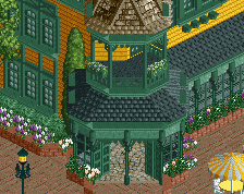
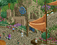
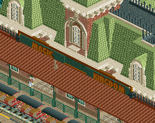
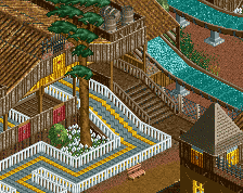
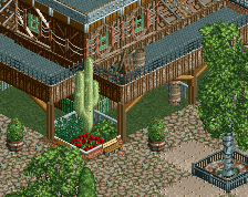
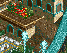
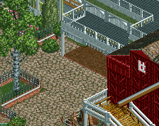
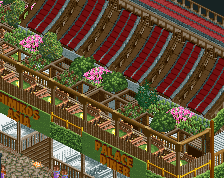
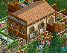
Here's the second area of my new project. Never done a custom rapids ride before, so that's the focal point of the area.
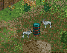
Also snuck in some trackitecture in some spots to provide different wall textures.. see if you can find them!
Beyond this screen and my last one, theres not much else to show at the moment! Feedback much appreciated as always. -
 Full-Size
-
4 fans
 Fans of this screenshot
-
 Tags
Tags
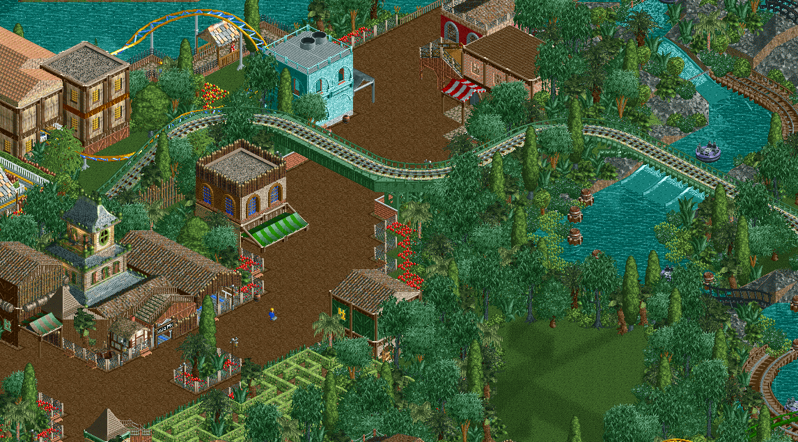
Oh man that hedge maze just fits in perfectly, great execution.
I do find myself wishing the train supports weren't green, Maybe a maroon shade would pop a bit more?
The rapids ride looks great also, really clever object use with the barrels
I think your color execution has gotten a lot better, shows more variety and blend.
The jungle foliage clumps are used really well and I like the look.
I like it, very good, especially on the right side of the screen. I think the textures could be cleaned up on the buildings, however.. there's a lot going on and many of them don't quite match the jungle theme.
Dude this is some of my favorite work from you yet. Colors are excellent.
I love that you've left open space in. Makes it easy to read and very believable. Love it.
Very beautiful I love the juxtaposition between the dense foliage and the more angular buildings. That railway support/bridge is also wonderful! It's often so hard to pull of diagonals well in RCT and you've really nailed it here
Just so lovable otter. Wish there was still more like this.
Really like everything except for the cyan building.
NCSO has been a hard sell for me so far - I was surprised to see it was such a trend when I returned to NE after my short 9 year break from NE - but I really like this screen! Good colour choices, especially liking the dark blue windows, and the scene has a very relaxed and unforced atmosphere to it.
I agree with SuicideCarz though on the cyan building, it looks a bit off both in regards to the prominence of that bright blue color and in regards to the architecture. An awning in front in a more subdued color might improve it - perhaps you can simply extend the grey awning that's on the backside of the building around the corner? And another thing is I think you should try to add in a vertical beam under the railway bridge just on the edge of the water, so that it looks a bit more properly supported and is easier to read.
Other than that good job, I'd like to see more!
This is right up my alley. Buildings, foliage, interactions, fencing, all that. And I like the train support colors as they are - it's a believable color but still fits the theme.
love this
This screen is just so good, so atmospheric. I love the 2x2 buildings, very retro in a very postive way, colours and textures are very well chosen. That patch of open grass does wonders for the foliage.
The bridge is very nicely done, and the foliage is brill. Not keen on the bit of crazy paving used as roof for the haunted house entrance.
@Terry: definitely will limit the wooden post trim in the next couple sections of the park. Sort of a motif in that area. Good suggestions!
And thanks everyone for the comments. Definitely helps!
Love the gears as the rotating bumpers
Nah, Terry pointed it out. I used the space rings ride as a wall texture on the building with the blue windows. Mixing new and old NCSO ideas